" height="51.00000104325758px" id="dwbgYO9wY" transform="translate(0 34)" width="80.99999949550477px"/></svg>)

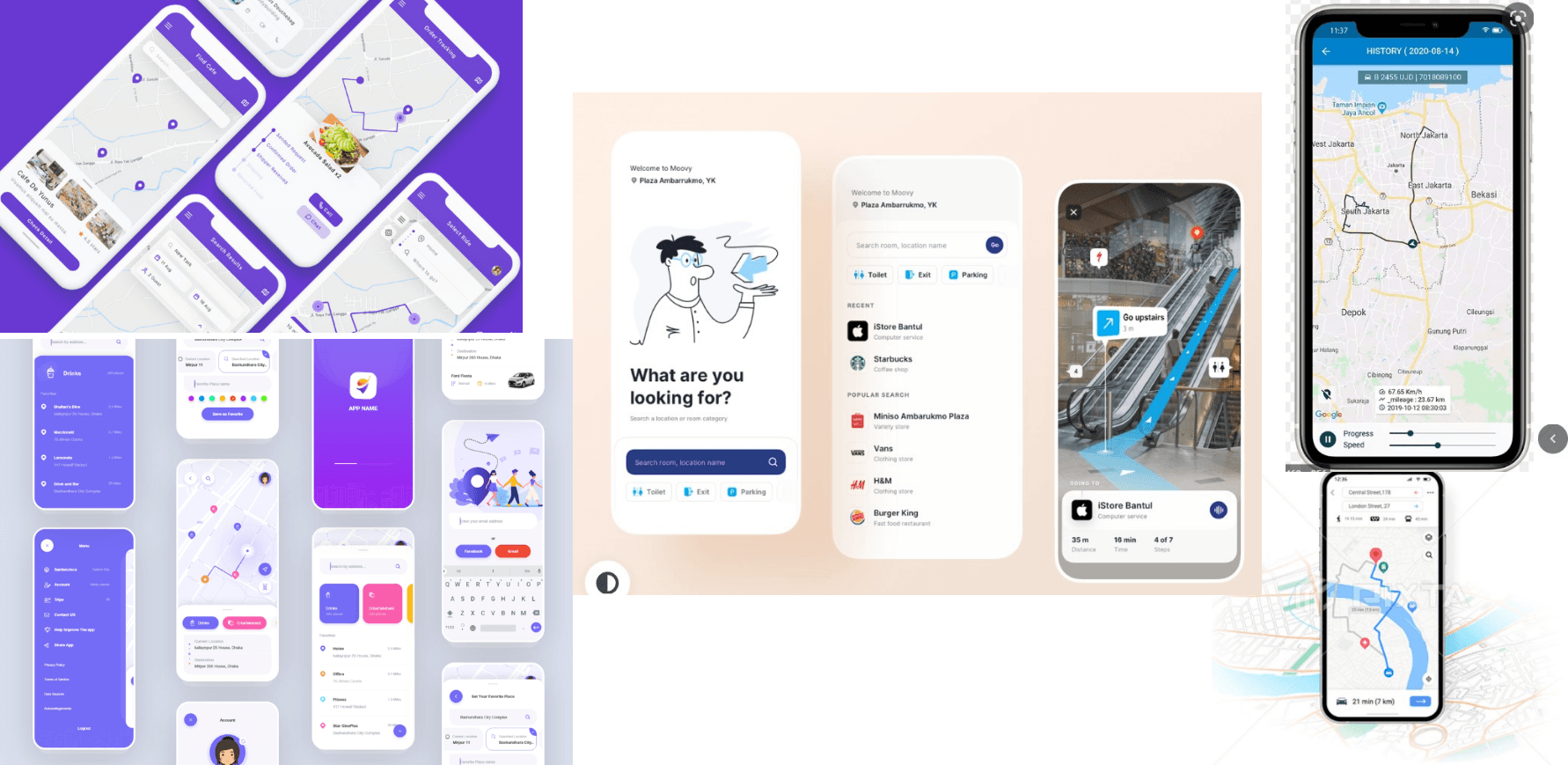
Sixth Sense
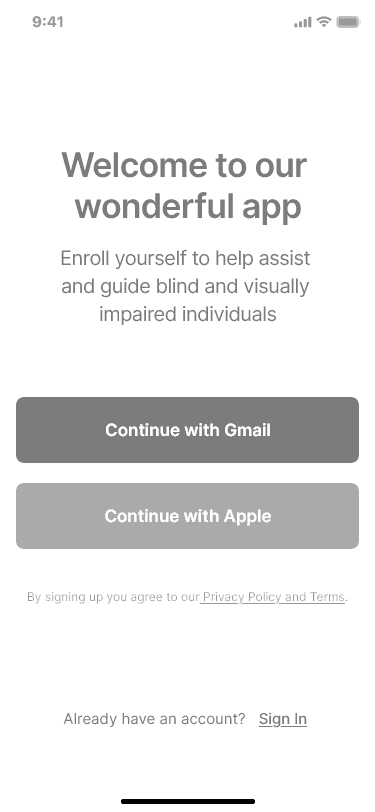
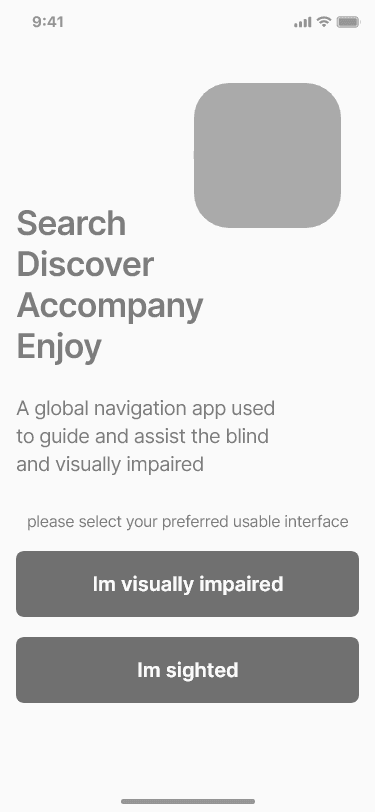
University project -an inclusive navigation experience designed to help visually impaired users navigate their surroundings safely and confidently.
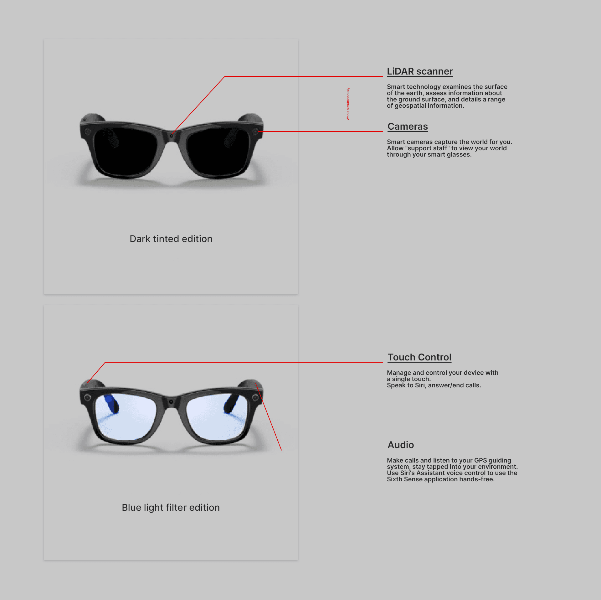
The solution combines a mobile app with smart glasses to deliver audio-first navigation, real-time guidance, and human support when needed. The project explores how accessibility, empathy, and UX strategy can be applied to high-stakes, real-world scenarios where traditional visual interfaces fail.
Problem
Most navigation apps are designed with sighted users in mind.
For visually impaired users, this creates significant barriers:
Heavy reliance on visual cues
Poor screen reader optimisation
Dense layouts that increase cognitive load
Lack of reassurance or human assistance in stressful situations
Many users feel unsafe, unsupported, or
excluded when navigating unfamiliar environments.
Objective
Design a navigation experience that:
Works for users with partial or no vision
Prioritises audio, touch, and system accessibility
Reduces cognitive and emotional stress
Provides human assistance when automation is insufficient
Feels inclusive rather than specialised or stigmatising
Role
UX/UI designer (end-to-end)
Timeline
5 weeks
Tools
Adobe XD, Photoshop

Research
& design approach
These key principles shaped the core product production:
Design for diverse abilities and contexts.
Support multiple interaction methods.
Reduce reliance on vision as the primary sense.
Prioritise safety, confidence, and clarity.
Instead of designing for a single “average” user, this project followed an inclusive design mindset, recognising that accessibility exists on a spectrum.
Accessibility was embedded into the design from the start:
Screen reader and voice-over optimisation.
High contrast colour usage and large text.
Minimal layouts to reduce cognitive load.
Predictable gestures and navigation patterns.
Voice dictation and live audio feedback.
Compatibility with smart invert, dark mode, and assistive technologies.
This approach ensured the experience could adapt to users’ needs rather than forcing users to adapt to the interface.
Research, Concept,
Designs, User Testing
& prototype in 6 weeks
Part 1 - Discovery & Understanding
I explored the emotional challenges people face when trying to manage their wellbeing. Through interviews, surveys, and competitor analysis, I defined the core problem, identified key behaviours, and created the primary persona and scenarios that shaped the direction of the product.
I led the full end-to-end process — from early discovery to final prototype — integrating psychology, accessibility, and gamification to design an app that feels calm, credible, and motivating.... and this is how I did it!
Part 2 - Design
Using those insights, I developed the information architecture, mapped key flows, and created wireframes centred on empathy, psychology, accessibility, and gentle motivation. From there, I designed high-fidelity screens with a warm, calming visual language that made the experience feel simple and emotionally supportive.
Guided check-in.
Part 3 - Usability testing & Refinement
I validated the product through usability testing. Feedback helped refine the tone, visuals, and interactions — strengthening clarity, reducing friction, and confirming emotional resonance. These improvements increased confidence in the product’s impact and ease of use.
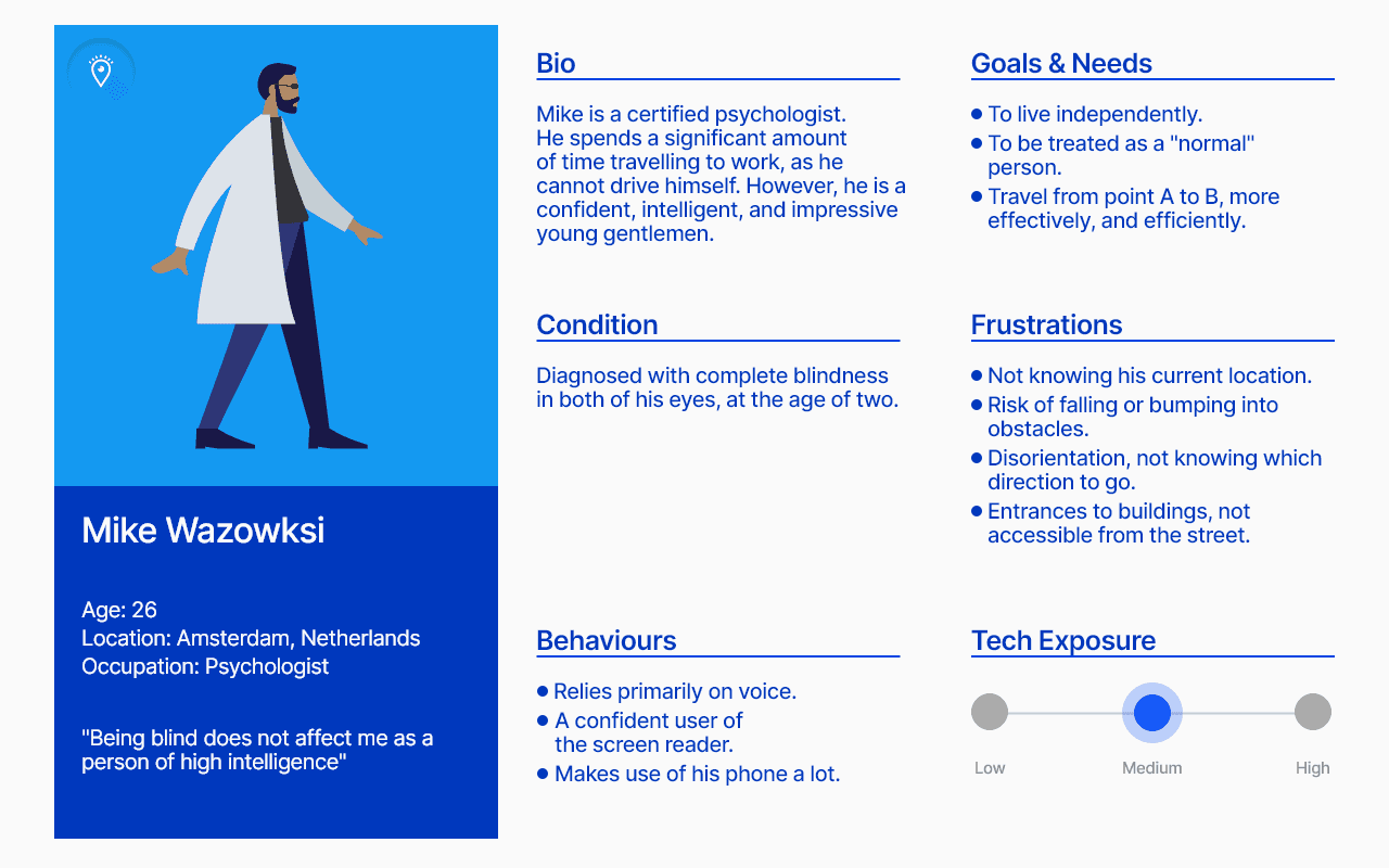
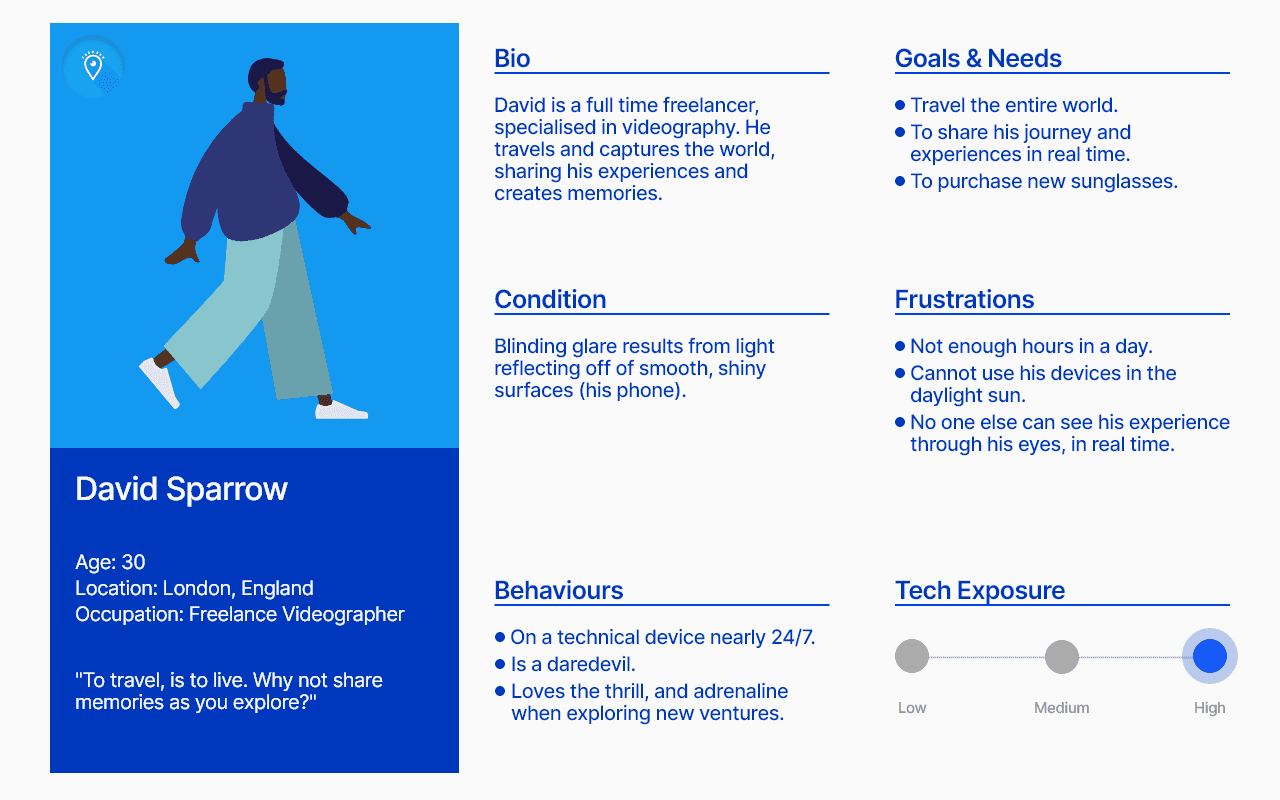
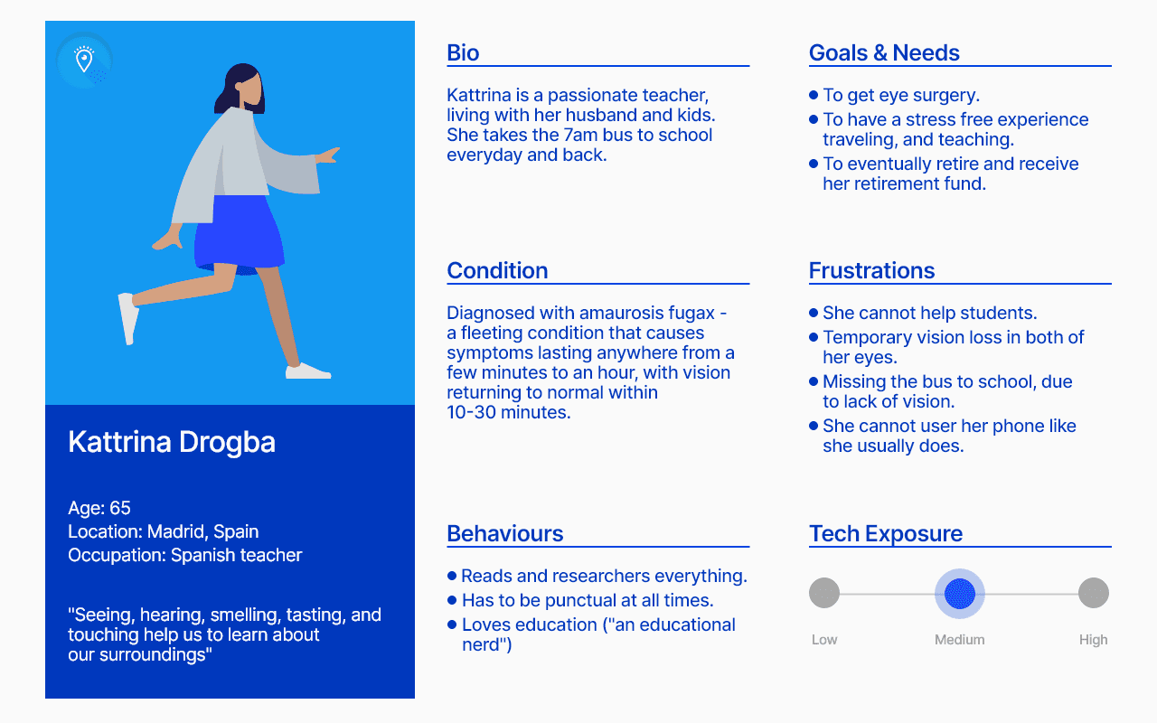
Persona Spectrum
Rather than a single persona, I designed for a persona spectrum, acknowledging that users may experience different levels of visual impairment depending on context, environment, or fatigue.
Support users with low vision.
Fully serve users with no vision.
Adapt to situational impairments (lighting, unfamiliar areas, stress).
This helped ensure the app could:
-
-
-
-
-
-
-
Research, Concept,
Designs, User Testing
& prototype in 6 weeks
Part 1 - Discovery & Understanding
I explored the emotional challenges people face when trying to manage their wellbeing. Through interviews, surveys, and competitor analysis, I defined the core problem, identified key behaviours, and created the primary persona and scenarios that shaped the direction of the product.
I led the full end-to-end process — from early discovery to final prototype — integrating psychology, accessibility, and gamification to design an app that feels calm, credible, and motivating.... and this is how I did it!
Part 2 - Design
Using those insights, I developed the information architecture, mapped key flows, and created wireframes centred on empathy, psychology, accessibility, and gentle motivation. From there, I designed high-fidelity screens with a warm, calming visual language that made the experience feel simple and emotionally supportive.
Guided check-in.
Part 3 - Usability testing & Refinement
I validated the product through usability testing. Feedback helped refine the tone, visuals, and interactions — strengthening clarity, reducing friction, and confirming emotional resonance. These improvements increased confidence in the product’s impact and ease of use.
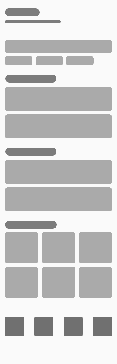
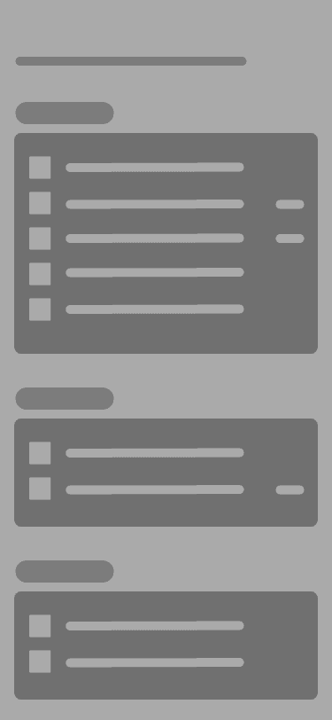
Inspiration
& Wireframes
Looking at existing similar concepts, ideas, and designs inspired the structure and feeling of my solution. Familiar mobile patterns were used to reduce learning friction (Jakob’s Law).
Wireframes focused on:
Clear hierarchy and spacing
Large, tappable elements
Minimal visual noise
Safety-critical actions being easy to access
Research, Concept,
Designs, User Testing
& prototype in 6 weeks
Part 1 - Discovery & Understanding
I explored the emotional challenges people face when trying to manage their wellbeing. Through interviews, surveys, and competitor analysis, I defined the core problem, identified key behaviours, and created the primary persona and scenarios that shaped the direction of the product.
I led the full end-to-end process — from early discovery to final prototype — integrating psychology, accessibility, and gamification to design an app that feels calm, credible, and motivating.... and this is how I did it!
Part 2 - Design
Using those insights, I developed the information architecture, mapped key flows, and created wireframes centred on empathy, psychology, accessibility, and gentle motivation. From there, I designed high-fidelity screens with a warm, calming visual language that made the experience feel simple and emotionally supportive.
Guided check-in.
Part 3 - Usability testing & Refinement
I validated the product through usability testing. Feedback helped refine the tone, visuals, and interactions — strengthening clarity, reducing friction, and confirming emotional resonance. These improvements increased confidence in the product’s impact and ease of use.
Core
Features
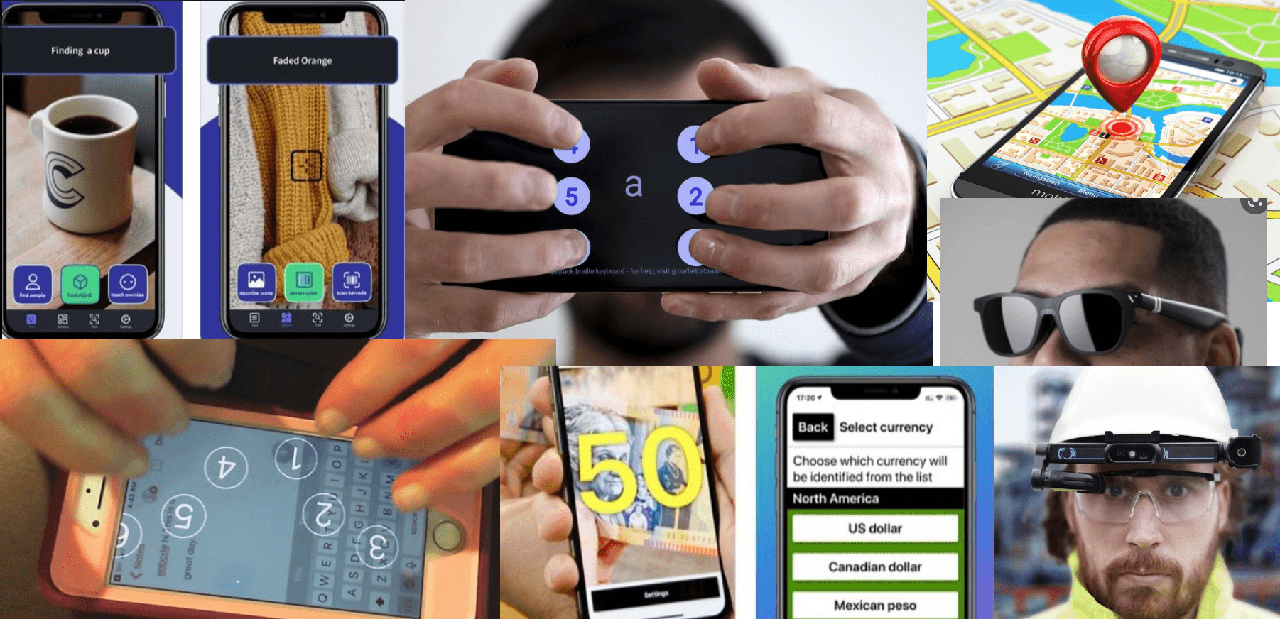
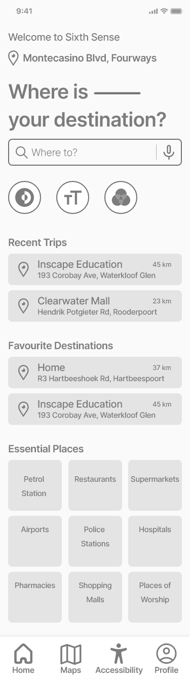
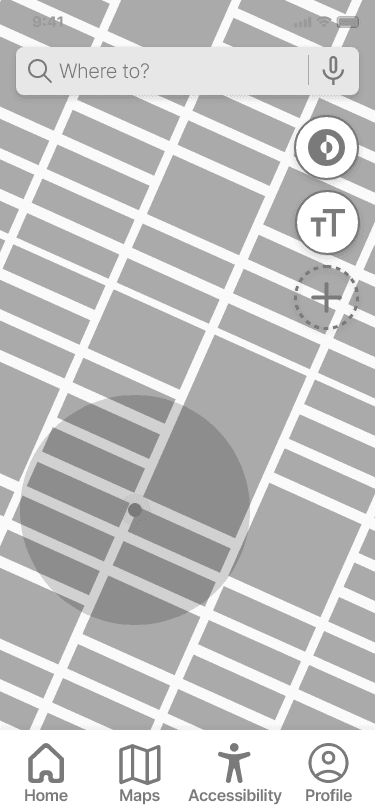
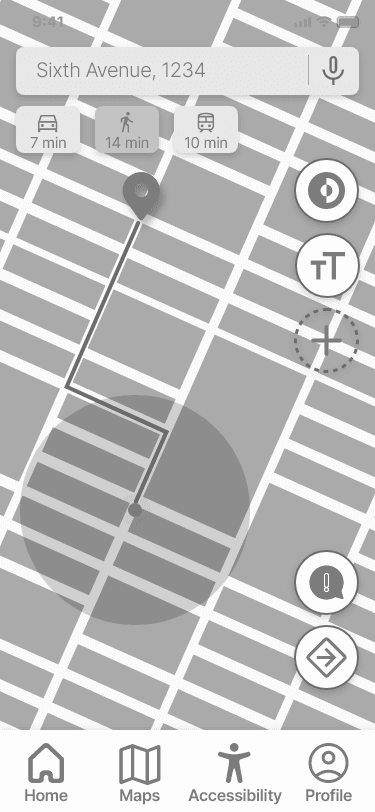
Navigation & Guidance
Turn-by-turn audio navigation via smart glasses
Spoken environmental cues and route updates
Alerts for obstacles, turns, and destination proximity
Reduce the mismatch between human capability and digital systems by creating an interface that adapts to the user.
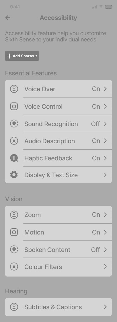
Accessibility Controls
Adjustable text size and contrast
Screen reader optimisation
Voice-based interaction
Simple, consistent gestures
Guided check-in.
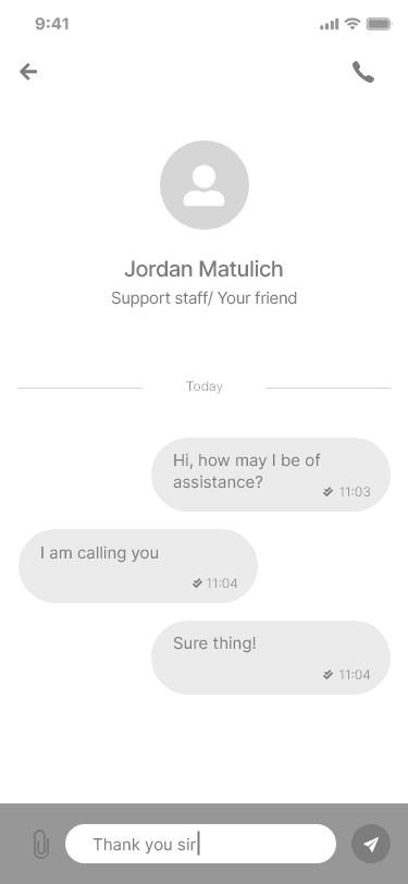
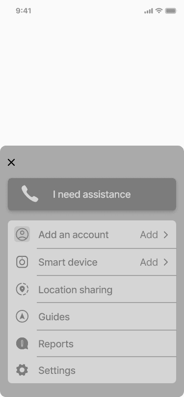
Human Support
Emergency “Need Assistance” action
Ability to contact a caregiver or trusted person
Human fallback when automated navigation is insufficient
Research, Concept,
Designs, User Testing
& prototype in 6 weeks
Part 1 - Discovery & Understanding
I explored the emotional challenges people face when trying to manage their wellbeing. Through interviews, surveys, and competitor analysis, I defined the core problem, identified key behaviours, and created the primary persona and scenarios that shaped the direction of the product.
I led the full end-to-end process — from early discovery to final prototype — integrating psychology, accessibility, and gamification to design an app that feels calm, credible, and motivating.... and this is how I did it!
Part 2 - Design
Using those insights, I developed the information architecture, mapped key flows, and created wireframes centred on empathy, psychology, accessibility, and gentle motivation. From there, I designed high-fidelity screens with a warm, calming visual language that made the experience feel simple and emotionally supportive.
Guided check-in.
Part 3 - Usability testing & Refinement
I validated the product through usability testing. Feedback helped refine the tone, visuals, and interactions — strengthening clarity, reducing friction, and confirming emotional resonance. These improvements increased confidence in the product’s impact and ease of use.
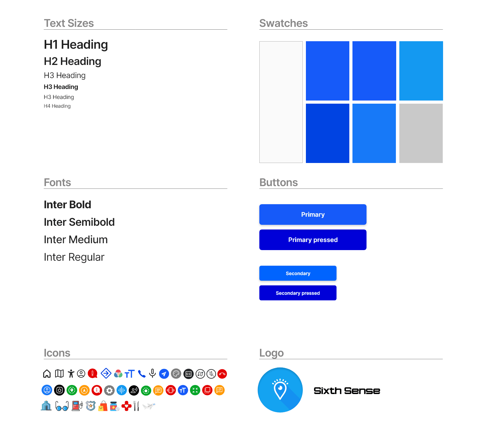
Visual
Design System
Blue chosen as the primary colour for clarity and colour-blind
accessibility
Rounded buttons to clearly indicate interactivity
Icons paired with text to avoid ambiguity
Minimalist layouts to reduce cognitive strain
Design decisions were informed by the Aesthetic-Usability Effect,
reinforcing calm, trust, and ease of use..
Research, Concept,
Designs, User Testing
& prototype in 6 weeks
Part 1 - Discovery & Understanding
I explored the emotional challenges people face when trying to manage their wellbeing. Through interviews, surveys, and competitor analysis, I defined the core problem, identified key behaviours, and created the primary persona and scenarios that shaped the direction of the product.
I led the full end-to-end process — from early discovery to final prototype — integrating psychology, accessibility, and gamification to design an app that feels calm, credible, and motivating.... and this is how I did it!
Part 2 - Design
Using those insights, I developed the information architecture, mapped key flows, and created wireframes centred on empathy, psychology, accessibility, and gentle motivation. From there, I designed high-fidelity screens with a warm, calming visual language that made the experience feel simple and emotionally supportive.
Guided check-in.
Part 3 - Usability testing & Refinement
I validated the product through usability testing. Feedback helped refine the tone, visuals, and interactions — strengthening clarity, reducing friction, and confirming emotional resonance. These improvements increased confidence in the product’s impact and ease of use.
Presenting
The final design
Users found the experience:
Easy to understand
Non-overwhelming
Thoughtfully designed for accessibility
Reassuring due to the presence of human support
Accessibility controls and audio navigation were highlighted as the most valuable features.
Research, Concept,
Designs, User Testing
& prototype in 6 weeks
Part 1 - Discovery & Understanding
I explored the emotional challenges people face when trying to manage their wellbeing. Through interviews, surveys, and competitor analysis, I defined the core problem, identified key behaviours, and created the primary persona and scenarios that shaped the direction of the product.
I led the full end-to-end process — from early discovery to final prototype — integrating psychology, accessibility, and gamification to design an app that feels calm, credible, and motivating.... and this is how I did it!
Part 2 - Design
Using those insights, I developed the information architecture, mapped key flows, and created wireframes centred on empathy, psychology, accessibility, and gentle motivation. From there, I designed high-fidelity screens with a warm, calming visual language that made the experience feel simple and emotionally supportive.
Guided check-in.
Part 3 - Usability testing & Refinement
I validated the product through usability testing. Feedback helped refine the tone, visuals, and interactions — strengthening clarity, reducing friction, and confirming emotional resonance. These improvements increased confidence in the product’s impact and ease of use.

Final reflections &
insights
Behind the design
Designing Sixth Sense challenged visual-first assumptions and shifted my focus toward human experience over interface aesthetics.
This project represents my ability to solve complex, real-world problems through empathy, accessibility, and thoughtful UX strategy
-especially in scenarios where design decisions directly impact safety and confidence.
This project strengthened my ability to:
Design beyond WCAG checklists
Think in systems rather than screens
Balance automation with human-centred support
Apply empathy to high-impact UX decisions
It reinforced that inclusive design leads to better design for everyone, not just edge cases.


