" height="51.00000104325758px" id="dwbgYO9wY" transform="translate(0 34)" width="80.99999949550477px"/></svg>)

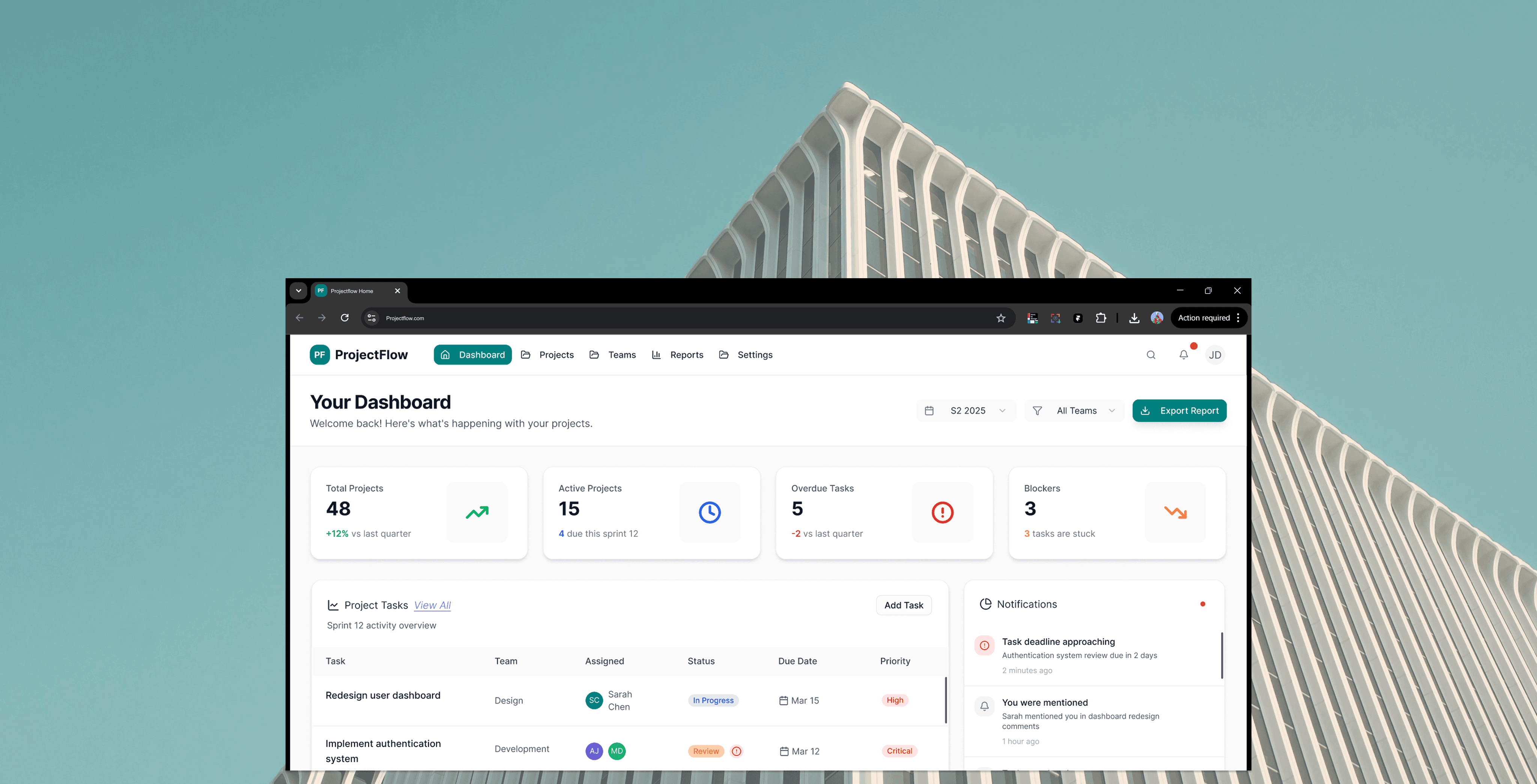
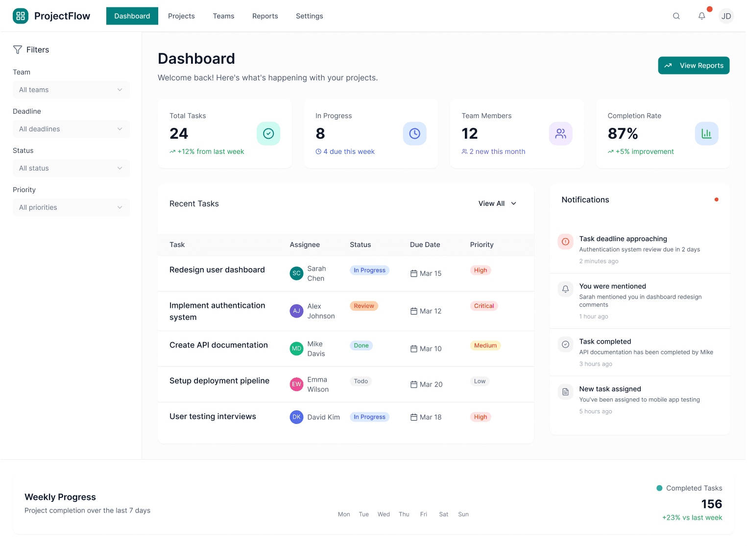
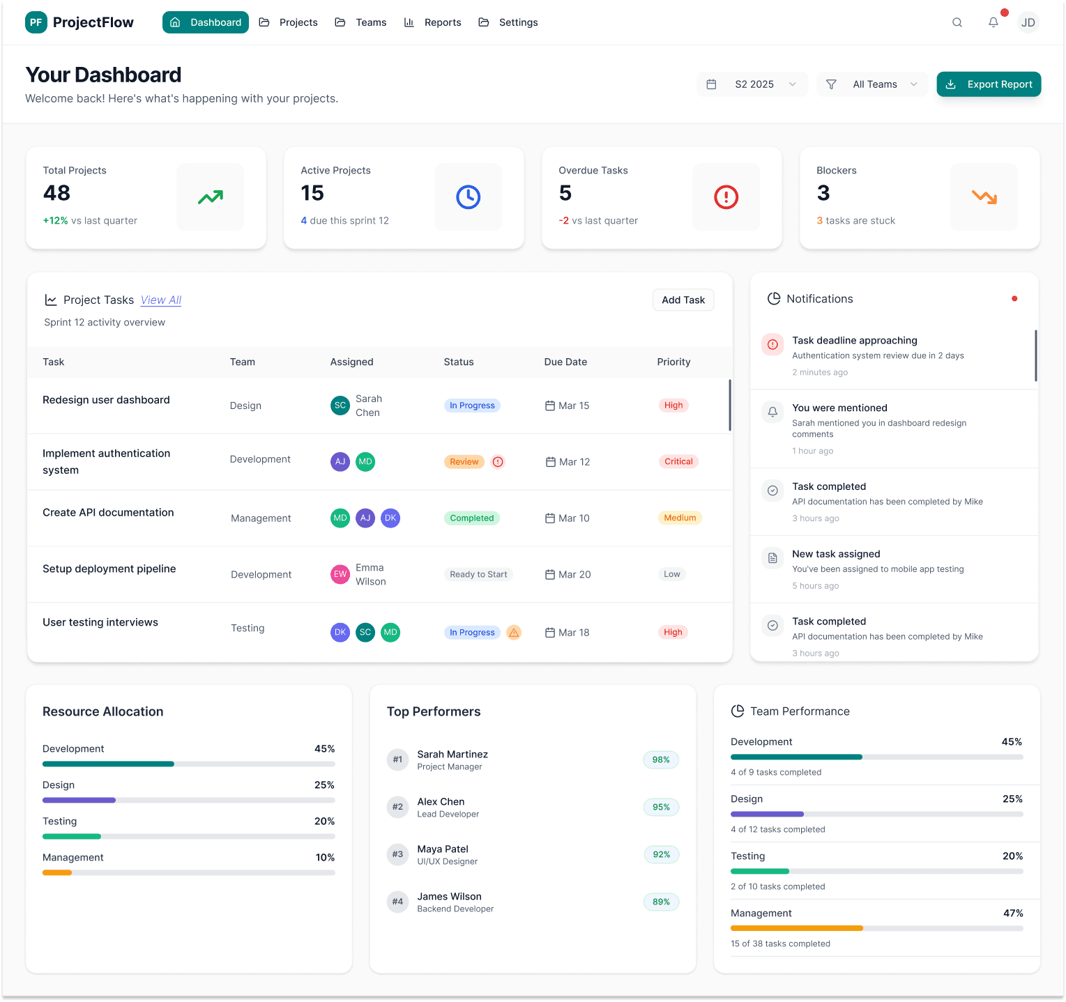
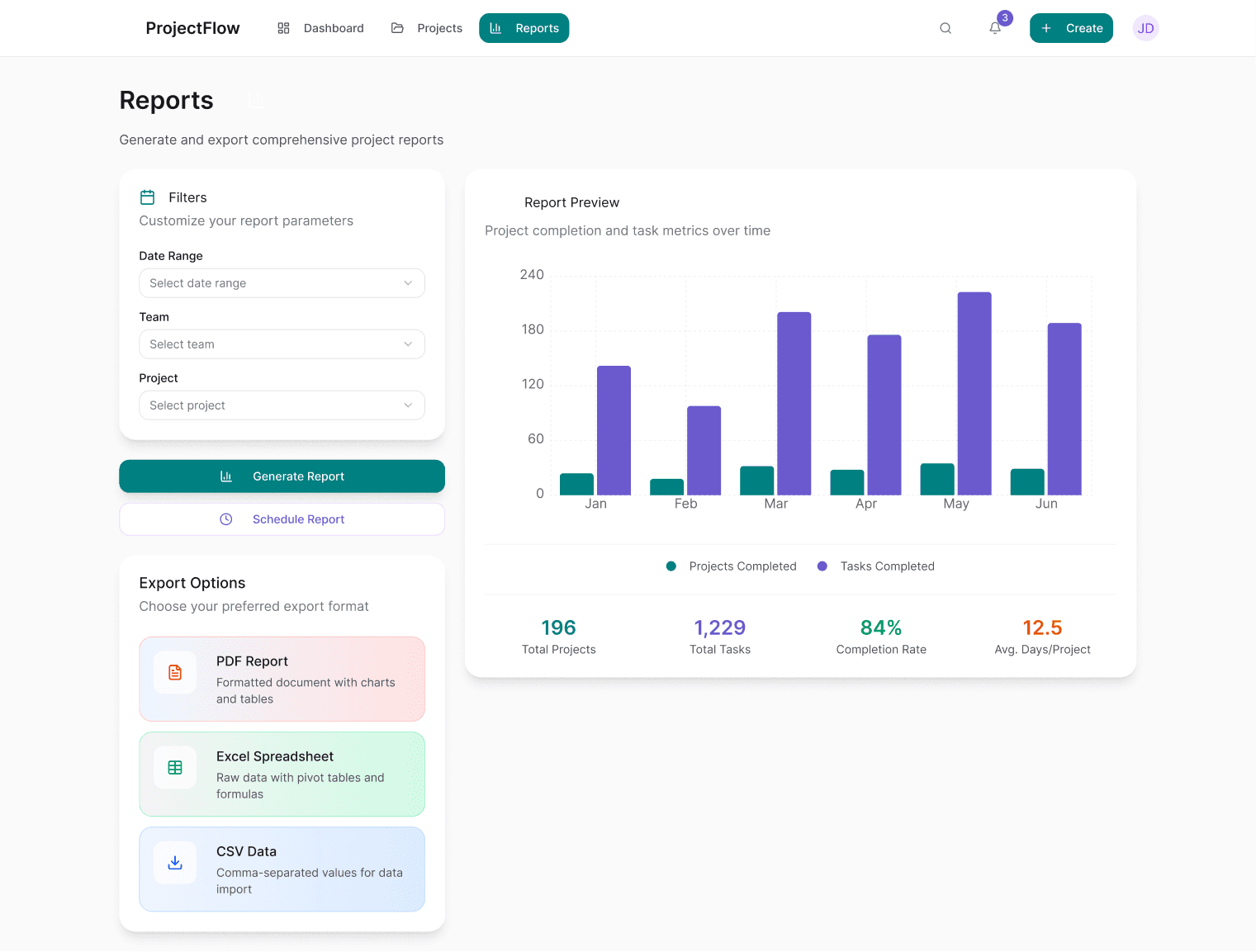
Project Flow
Personal project -a project management dashboard that helps teams plan, track, and deliver work more effectively without cognitive overload
The goal was to transform fragmented project data into a clear, actionable system that supports both individual contributors and managers in real-world work environments
Problem
Many project management tools overwhelm users with excessive features, dense interfaces, and unclear priorities.
Teams struggle to understand:
What needs attention right now
What is blocked
Where projects are at risk
This leads to missed deadlines, duplicated work, and reduced team confidence.
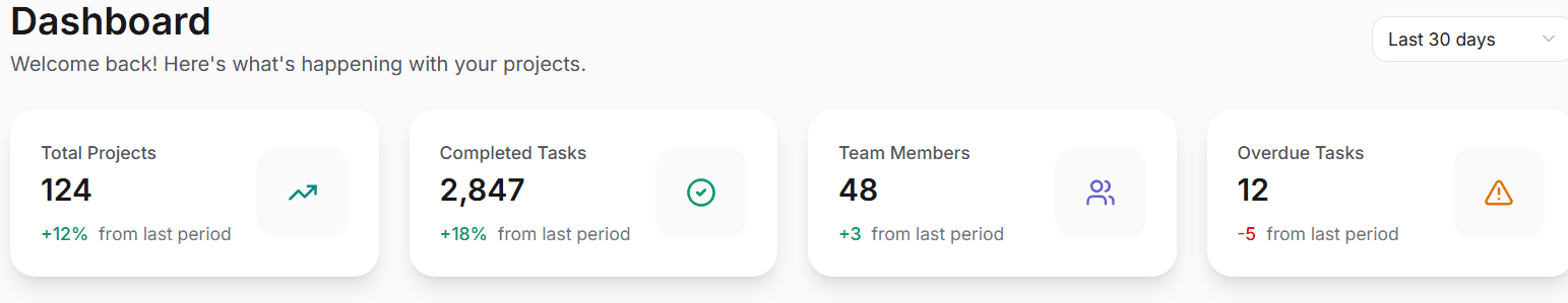
Objectives
Design a clear, structured dashboard that supports fast decision-making
Reduce cognitive load for daily task management
Improve visibility of blockers, priorities, and progress
Support both team members and managers with the same system
Role
UX/UI designer (end-to-end)
Timeline
3 weeks
Tools
Figma, Stitch, Lovable.dev, Chat GPT Pro
These key insights shaped the core product production:
Research Results
& Findings
I conducted qualitative research through:
Informal interviews with professionals using tools like Jira, Asana, and Monday.
Competitive analysis of existing project management platforms.
I learned that a successful dashboard should answer three questions instantly: What do I need to do? What’s blocking me? and What needs attention now?
Users don’t want more data — they want clear priorities.
Blockers are often hidden or surfaced too late.
Status updates are time-consuming and repetitive.
Visual hierarchy matters more than feature volume.
Structure the dashboard around decision-driven UX, not feature-driven UX.
Progressive disclosure (show what matters first).
Status clarity over aesthetics.
100%
-
-
-
-
-
-
Research, Concept,
Designs, User Testing
& prototype in 6 weeks
Part 1 - Discovery & Understanding
I explored the emotional challenges people face when trying to manage their wellbeing. Through interviews, surveys, and competitor analysis, I defined the core problem, identified key behaviours, and created the primary persona and scenarios that shaped the direction of the product.
I led the full end-to-end process — from early discovery to final prototype — integrating psychology, accessibility, and gamification to design an app that feels calm, credible, and motivating.... and this is how I did it!
Part 2 - Design
Using those insights, I developed the information architecture, mapped key flows, and created wireframes centred on empathy, psychology, accessibility, and gentle motivation. From there, I designed high-fidelity screens with a warm, calming visual language that made the experience feel simple and emotionally supportive.
Guided check-in.
Part 3 - Usability testing & Refinement
I validated the product through usability testing. Feedback helped refine the tone, visuals, and interactions — strengthening clarity, reducing friction, and confirming emotional resonance. These improvements increased confidence in the product’s impact and ease of use.
Asana
Jira
Powerful, but cognitively heavy
My Solution
Clarity-first, UX-led system
Simple & intuitive
Complex & feature-heavy
Task execution focused
Monday.com
Flexible but overwhelming
UX Complexity
Decision-making & prioritisation
Decision Clarity
This analysis revealed a gap in the market: while existing tools offer powerful functionality, they often sacrifice clarity. My solution prioritises
decision-making and usability, reducing cognitive load while supporting real-world team workflows.
Users
& Context
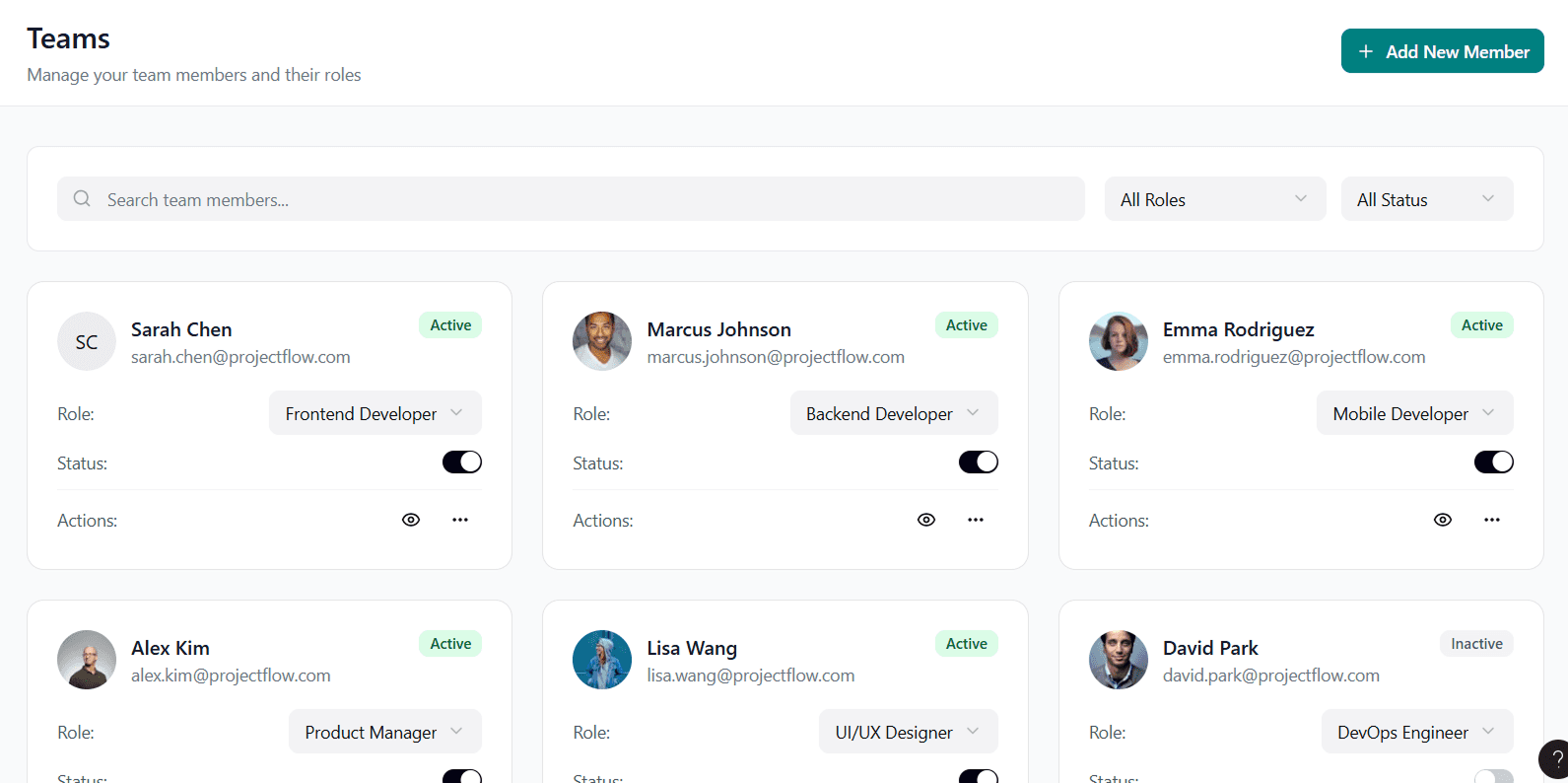
Primary User Groups:
Team Members: Need clarity on tasks, blockers, and deadlines.
Team Leads / Managers: Need progress visibility and risk awareness.
Both groups needed different insights from the same data,
without creating separate systems.

Research, Concept,
Designs, User Testing
& prototype in 6 weeks
Part 1 - Discovery & Understanding
I explored the emotional challenges people face when trying to manage their wellbeing. Through interviews, surveys, and competitor analysis, I defined the core problem, identified key behaviours, and created the primary persona and scenarios that shaped the direction of the product.
I led the full end-to-end process — from early discovery to final prototype — integrating psychology, accessibility, and gamification to design an app that feels calm, credible, and motivating.... and this is how I did it!
Part 2 - Design
Using those insights, I developed the information architecture, mapped key flows, and created wireframes centred on empathy, psychology, accessibility, and gentle motivation. From there, I designed high-fidelity screens with a warm, calming visual language that made the experience feel simple and emotionally supportive.
Guided check-in.
Part 3 - Usability testing & Refinement
I validated the product through usability testing. Feedback helped refine the tone, visuals, and interactions — strengthening clarity, reducing friction, and confirming emotional resonance. These improvements increased confidence in the product’s impact and ease of use.
AI
as a design partner
Used AI to cluster qualitative insights from research notes.
Stress-tested edge cases and error states I might have missed.
Refined UX copy for clarity and accessibility.
Research, Concept,
Designs, User Testing
& prototype in 6 weeks
Part 1 - Discovery & Understanding
I explored the emotional challenges people face when trying to manage their wellbeing. Through interviews, surveys, and competitor analysis, I defined the core problem, identified key behaviours, and created the primary persona and scenarios that shaped the direction of the product.
I led the full end-to-end process — from early discovery to final prototype — integrating psychology, accessibility, and gamification to design an app that feels calm, credible, and motivating.... and this is how I did it!
Part 2 - Design
Using those insights, I developed the information architecture, mapped key flows, and created wireframes centred on empathy, psychology, accessibility, and gentle motivation. From there, I designed high-fidelity screens with a warm, calming visual language that made the experience feel simple and emotionally supportive.
Guided check-in.
Part 3 - Usability testing & Refinement
I validated the product through usability testing. Feedback helped refine the tone, visuals, and interactions — strengthening clarity, reducing friction, and confirming emotional resonance. These improvements increased confidence in the product’s impact and ease of use.
Design decisions
& iterations
Early in the process, I explored multiple layout and information hierarchy options mentally and with AI-assisted flow exploration. I evaluated these options against usability heuristics, requirements, scalability needs, and rapid user testing before moving directly into high-fidelity design.
Research, Concept,
Designs, User Testing
& prototype in 6 weeks
Part 1 - Discovery & Understanding
I explored the emotional challenges people face when trying to manage their wellbeing. Through interviews, surveys, and competitor analysis, I defined the core problem, identified key behaviours, and created the primary persona and scenarios that shaped the direction of the product.
I led the full end-to-end process — from early discovery to final prototype — integrating psychology, accessibility, and gamification to design an app that feels calm, credible, and motivating.... and this is how I did it!
Part 2 - Design
Using those insights, I developed the information architecture, mapped key flows, and created wireframes centred on empathy, psychology, accessibility, and gentle motivation. From there, I designed high-fidelity screens with a warm, calming visual language that made the experience feel simple and emotionally supportive.
Guided check-in.
Part 3 - Usability testing & Refinement
I validated the product through usability testing. Feedback helped refine the tone, visuals, and interactions — strengthening clarity, reducing friction, and confirming emotional resonance. These improvements increased confidence in the product’s impact and ease of use.
Before
After
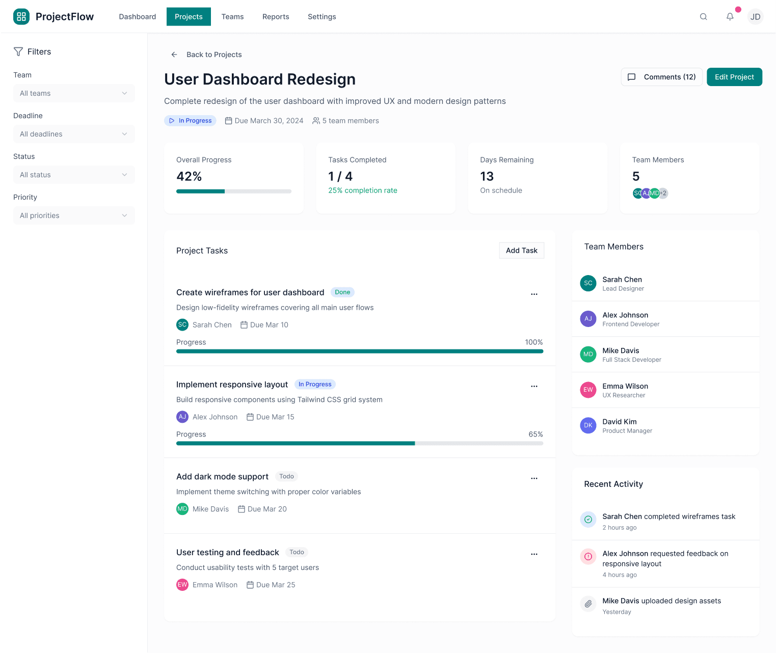
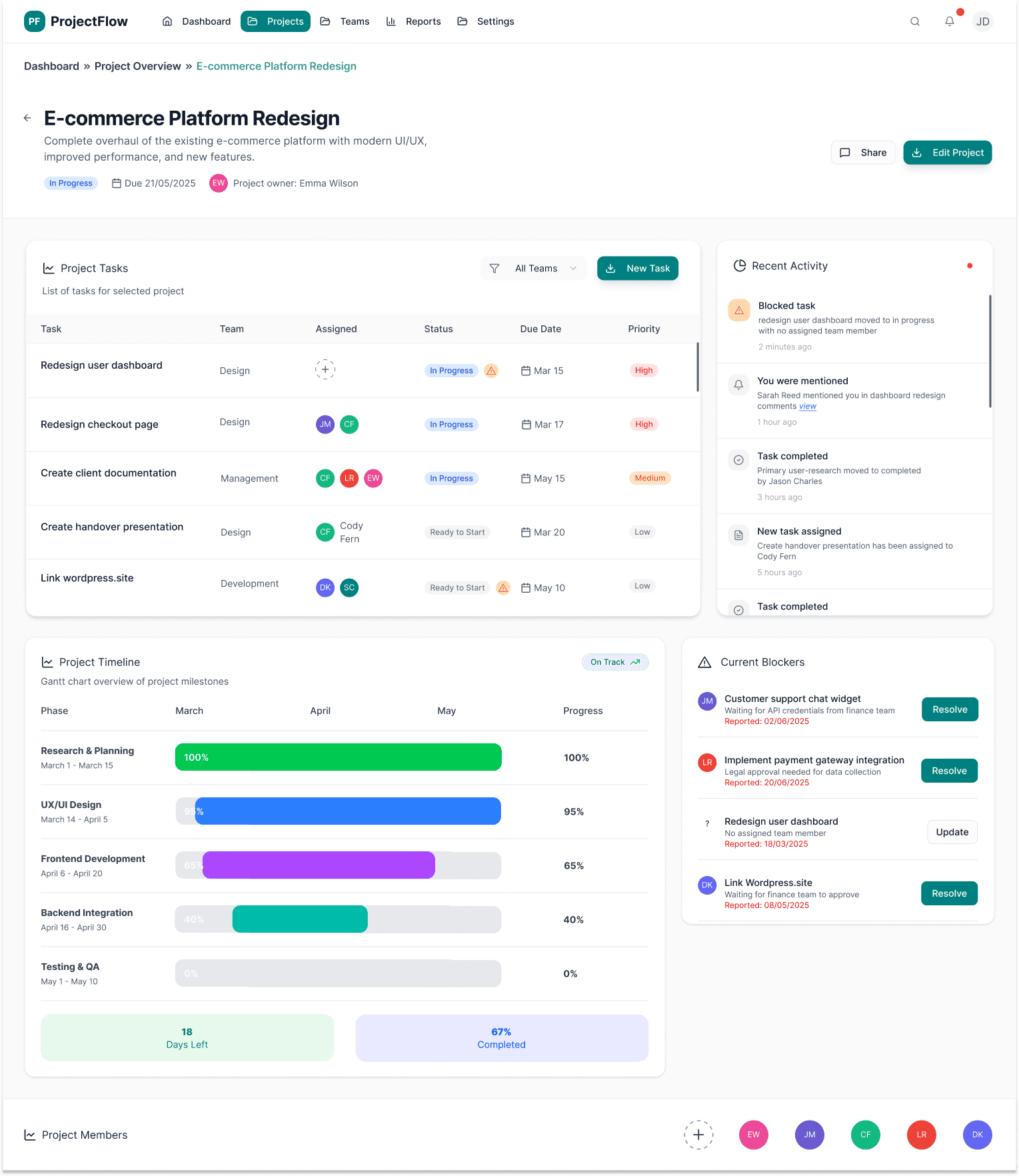
Dashboard: Moved filters to a more prominent location at the top, redesigned with pill-shaped filter chips for clarity.
Before
After
Blockers: improved visual hierarchy with color-coded severity tags (Critical, Moderate, Minor).
Research, Concept,
Designs, User Testing
& prototype in 6 weeks
Part 1 - Discovery & Understanding
I explored the emotional challenges people face when trying to manage their wellbeing. Through interviews, surveys, and competitor analysis, I defined the core problem, identified key behaviours, and created the primary persona and scenarios that shaped the direction of the product.
I led the full end-to-end process — from early discovery to final prototype — integrating psychology, accessibility, and gamification to design an app that feels calm, credible, and motivating.... and this is how I did it!
Part 2 - Design
Using those insights, I developed the information architecture, mapped key flows, and created wireframes centred on empathy, psychology, accessibility, and gentle motivation. From there, I designed high-fidelity screens with a warm, calming visual language that made the experience feel simple and emotionally supportive.
Guided check-in.
Part 3 - Usability testing & Refinement
I validated the product through usability testing. Feedback helped refine the tone, visuals, and interactions — strengthening clarity, reducing friction, and confirming emotional resonance. These improvements increased confidence in the product’s impact and ease of use.
AI assisted
final design
Before finalizing the UI, I used AI to simulate user scenarios, uncover unclear interactions, and validate accessibility and cognitive load. This helped identify friction points early without requiring formal user testing.
Research, Concept,
Designs, User Testing
& prototype in 6 weeks
Part 1 - Discovery & Understanding
I explored the emotional challenges people face when trying to manage their wellbeing. Through interviews, surveys, and competitor analysis, I defined the core problem, identified key behaviours, and created the primary persona and scenarios that shaped the direction of the product.
I led the full end-to-end process — from early discovery to final prototype — integrating psychology, accessibility, and gamification to design an app that feels calm, credible, and motivating.... and this is how I did it!
Part 2 - Design
Using those insights, I developed the information architecture, mapped key flows, and created wireframes centred on empathy, psychology, accessibility, and gentle motivation. From there, I designed high-fidelity screens with a warm, calming visual language that made the experience feel simple and emotionally supportive.
Guided check-in.
Part 3 - Usability testing & Refinement
I validated the product through usability testing. Feedback helped refine the tone, visuals, and interactions — strengthening clarity, reducing friction, and confirming emotional resonance. These improvements increased confidence in the product’s impact and ease of use.


Final reflections &
insights
Behind the design
This project reflects a modern UX approach, where AI is used to accelerate execution while UX judgment drives the outcome.
I used AI tools to rapidly generate and iterate high-fidelity dashboard layouts, allowing me to focus on information architecture,
systems thinking, and real-world usability rather than manual wireframing.
Key UX decisions -such as prioritising tasks, surfacing blockers, and reducing cognitive load -were driven by user needs and business context, not the tools themselves.
Working directly in high-fidelity enabled faster validation of hierarchy, clarity, and interaction patterns, aligning with how many
product teams operate today.
This project demonstrates my ability to design complex, data-heavy products efficiently while maintaining strong UX principles and
business relevance.
