Sixth Sense
University project - An accessibility-first navigation experience
for visually impaired users
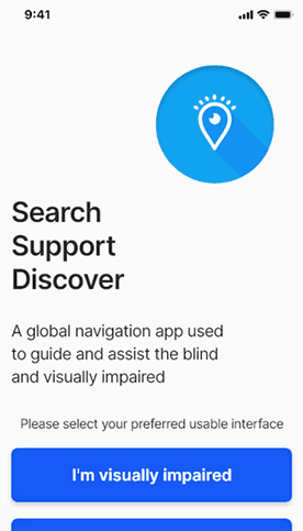
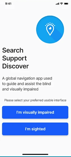
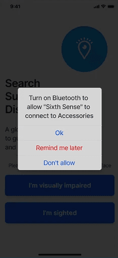
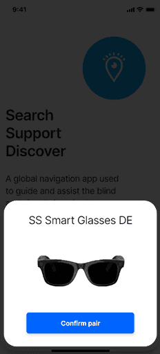
Sixth Sense is an inclusive navigation concept designed to help visually impaired users navigate unfamiliar environments safely, confidently, and independently.
Rather than adapting existing visual-first navigation patterns, this project explored how accessibility, empathy, and UX strategy can be used to design a navigation experience that prioritises non-visual interaction from the outset.
Problem
Most navigation apps are designed with sighted users in mind.
For visually impaired users, this creates significant barriers:
Heavy reliance on visual cues and maps
Poor screen-reader optimisation
Interfaces that increase cognitive load
Limited reassurance or fallback support in stressful situations
As a result, navigating unfamiliar environments can feel unsafe, isolating, and overwhelming.
Objective
Explore a navigation concept that:
Prioritises non-visual guidance
Supports users through audio, haptics, and simplified interactions
Reduces cognitive and emotional load during navigation
Encourages independence while still offering human support when needed
This project was conceptual and exploratory, focused on UX strategy and interaction design rather than production implementation.
Role
UX/UI designer (end-to-end)
Timeline
5 weeks
Tools
Adobe XD, Photoshop
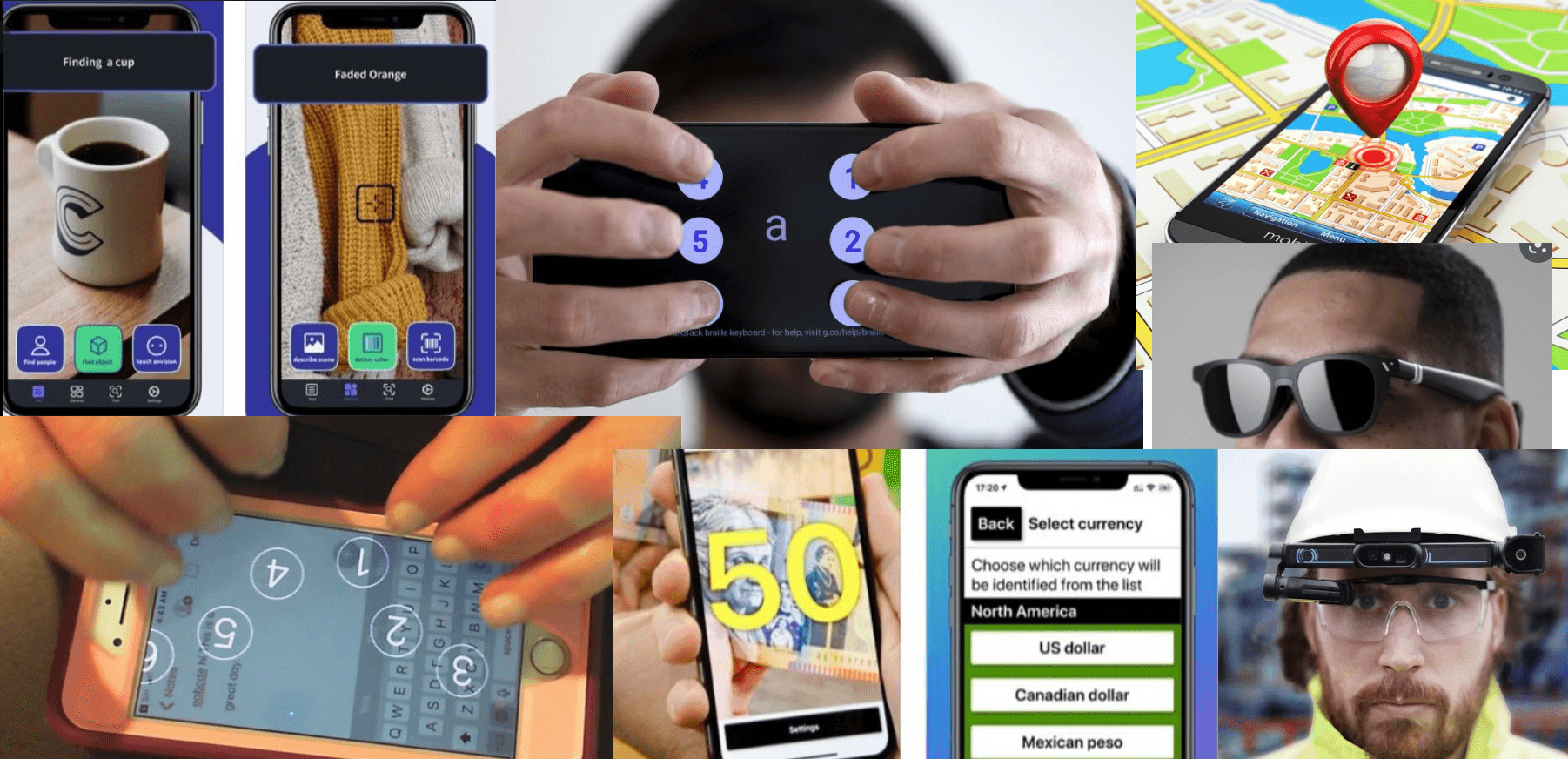
Research &
Accessibility Approach
Research was informed by:
WCAG accessibility guidelines
Existing assistive navigation tools
Articles and studies on cognitive load and wayfinding for visually impaired users
Key insights included:
Overly dense interfaces increase cognitive strain
Audio guidance must be contextual, not constant
Users need reassurance that they are on the correct path
Clear fallback options reduce anxiety during navigation
These insights directly informed interaction, layout, and feedback decisions throughout the concept.
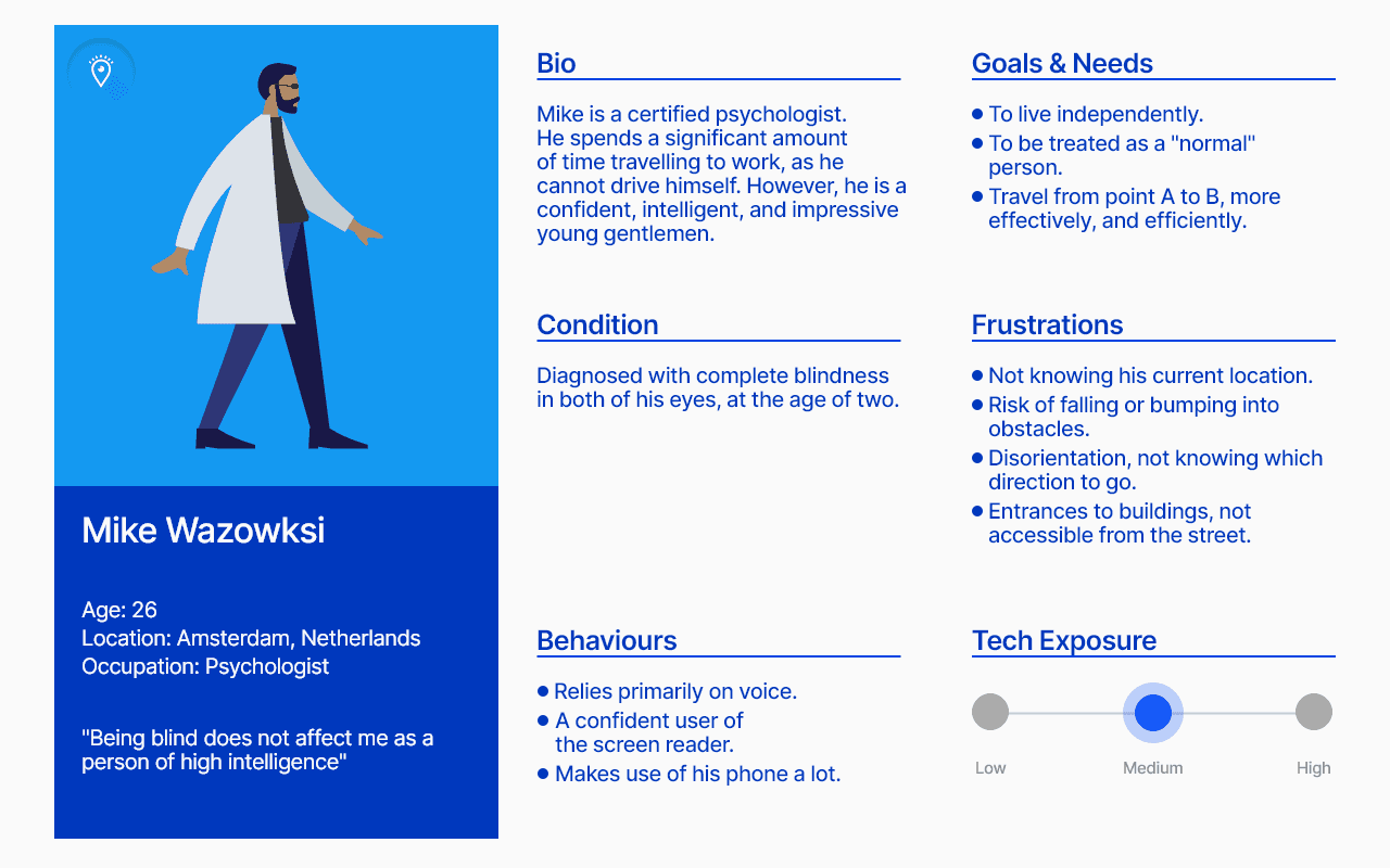
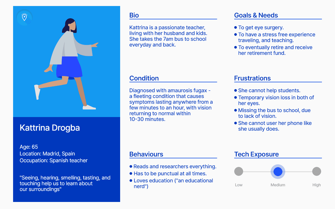
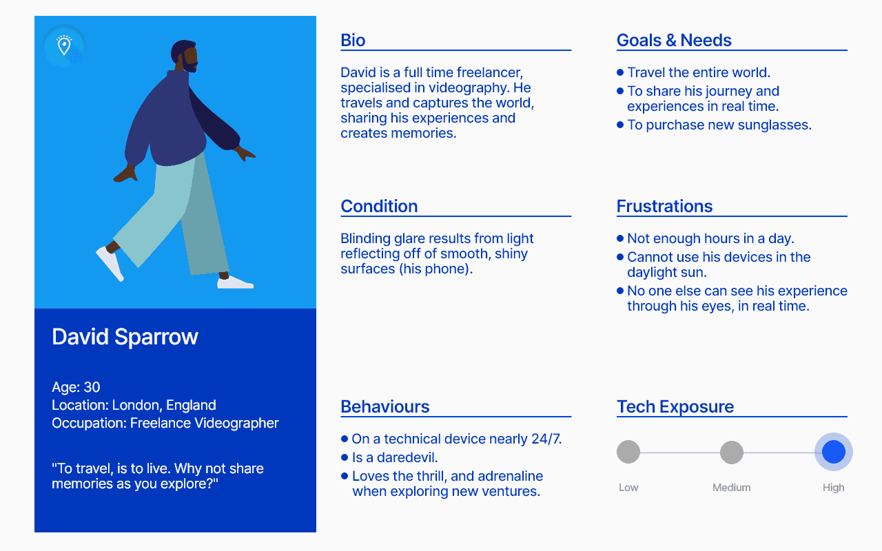
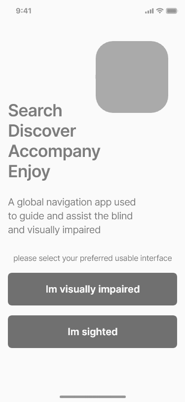
Persona Spectrum
Rather than designing for a single persona, the project considered a spectrum of users who may experience visual impairment differently depending on context, environment, or fatigue.
This ensured the experience could support:
Users with low vision
Users with no vision
Situational impairments (poor lighting, unfamiliar areas,
stress)
Design decisions were evaluated against how well they
supported flexibility, reassurance, and clarity
across this spectrum.
UX Strategy
The UX strategy focused on supporting confident navigation without relying on sight, and every design decision was evaluated against one core question:
Can a user safely and confidently navigate without visual
confirmation?
This led to a strategy centred on:
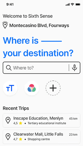
• Audio and haptic feedback as primary guidance.
• Minimal on-screen information to reduce cognitive load.
• Clear reassurance at key moments (“you’re on the
right path”).
• Human support as a fallback when automation is insufficient
• Clear reassurance at key moments (“you’re on the right path”)
• Human support as a fallback when automation is insufficient
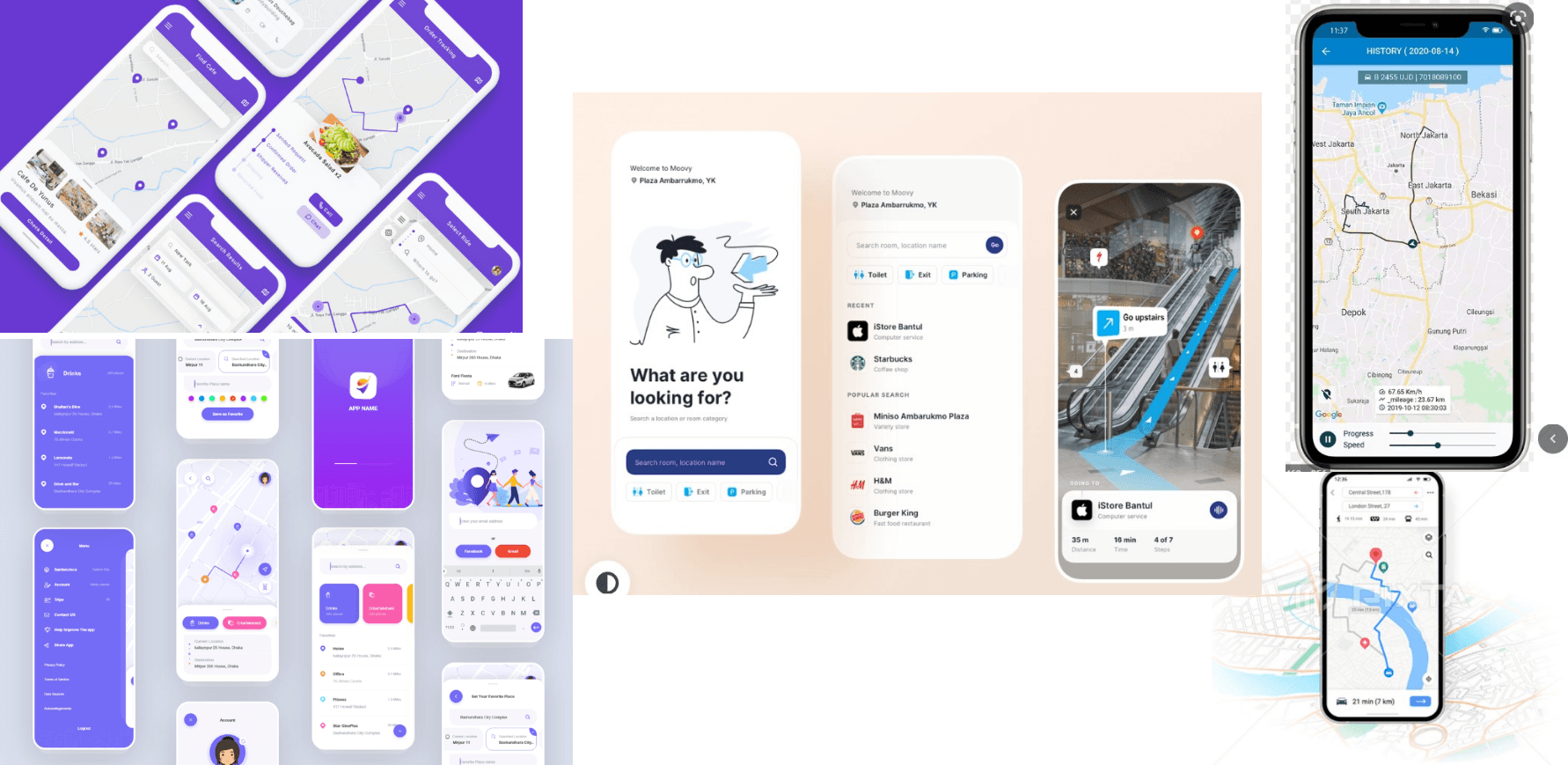
Inspiration &
Wireframes
This phase explored layout, hierarchy, and interaction patterns.
It also helped validate structural decisions early, ensuring the final designs supported accessibility and clarity before visual styling was applied.
Exploration focused on:
• Reducing visual complexity and screen density
• Prioritising audio and haptic controls
• Clear placement of reassurance and assistance features
• Large touch targets and predictable interactions


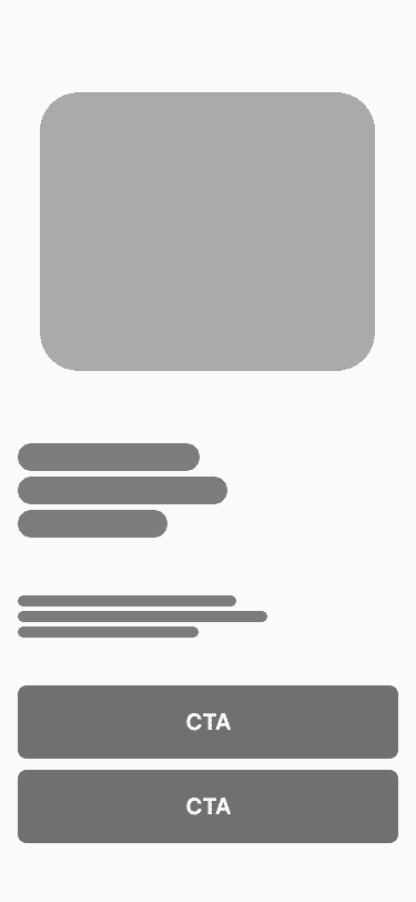


Core
Features
Reduce the mismatch between human capability and digital systems by creating an interface that adapts to the user.
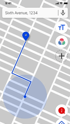
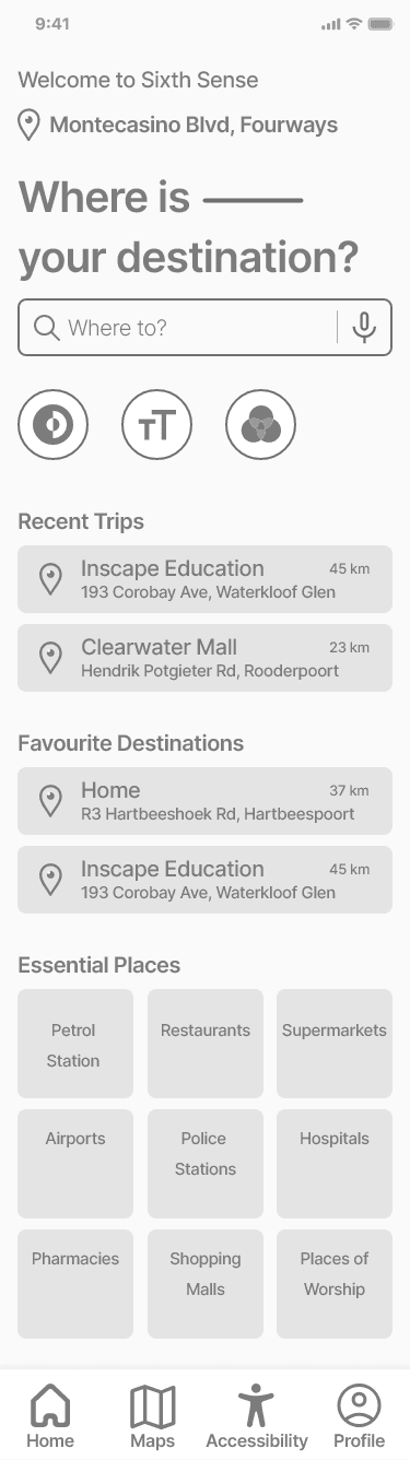
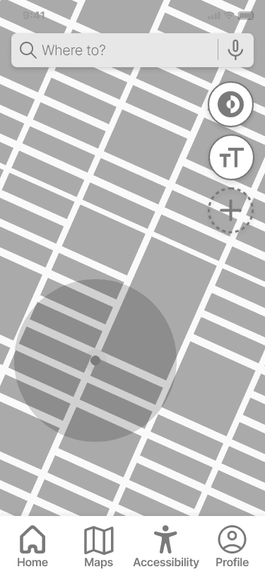
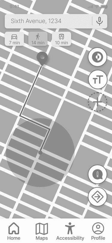
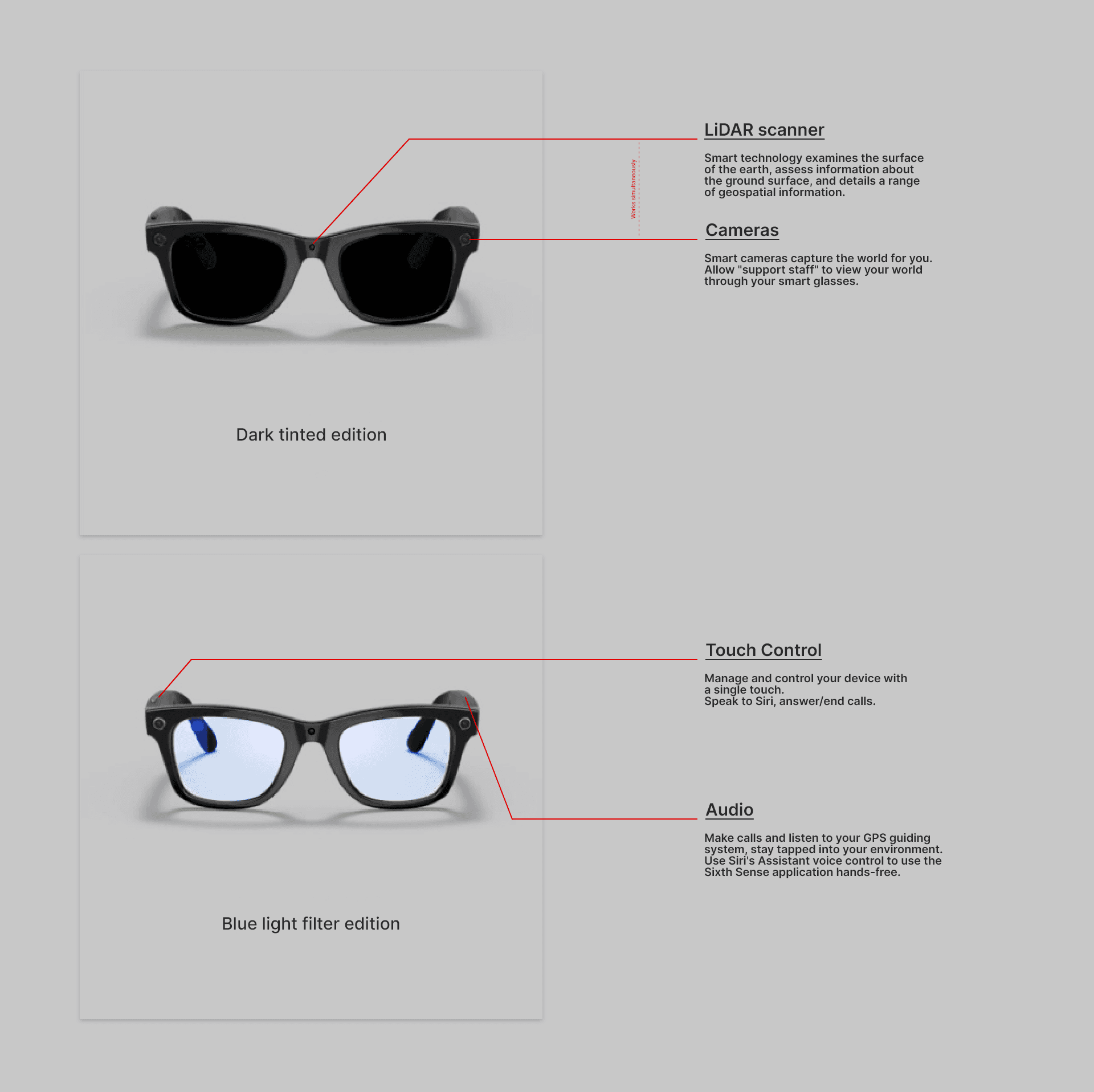
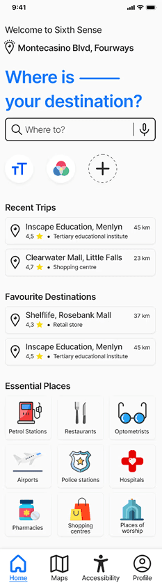
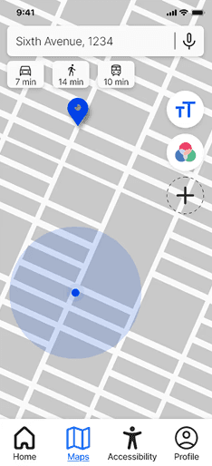
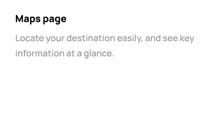
Navigation & Guidance
• Turn-by-turn audio navigation as the primary
guidance method
• Alerts for turns, landmarks, and route confirmation
• Haptic feedback for reassurance and confirmation
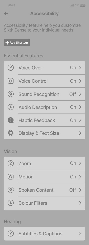
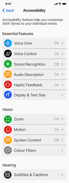
Accessibility Controls
• Adjustable text size and contrast
• Voice-based input and navigation
• Predictable, consistent gesture patterns
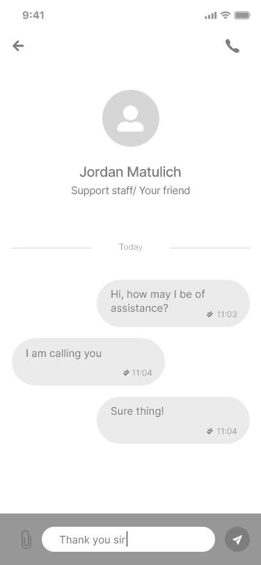
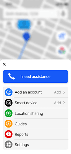
Human Support
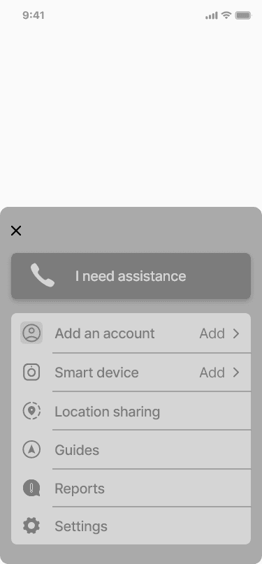
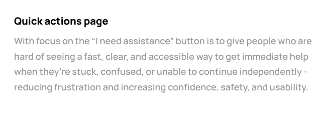
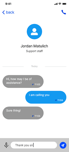
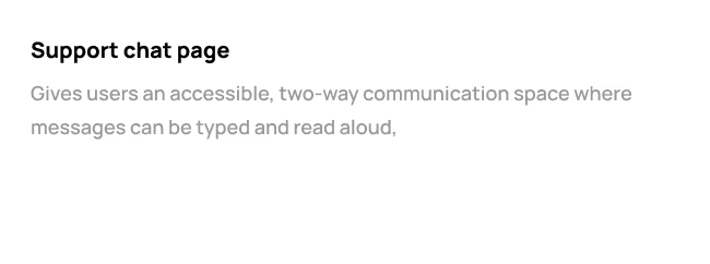
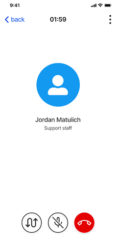
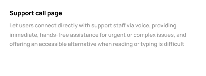
• Emergency “Need Assistance” feature
• Ability to contact a trusted person
• Human fallback when automated navigation is insufficient
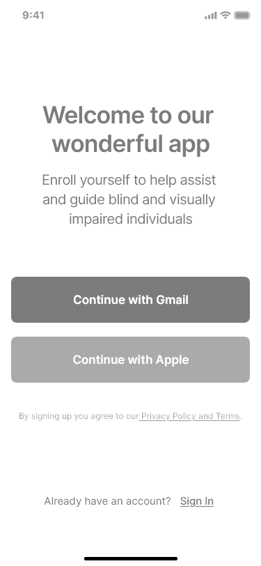
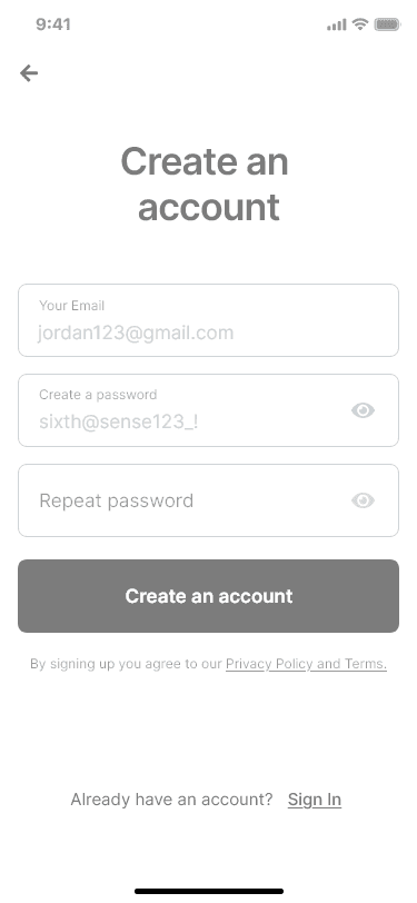
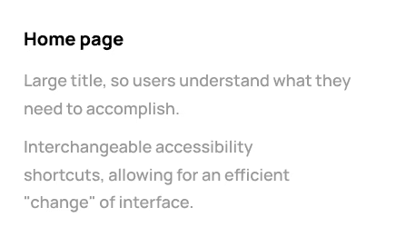
Visual
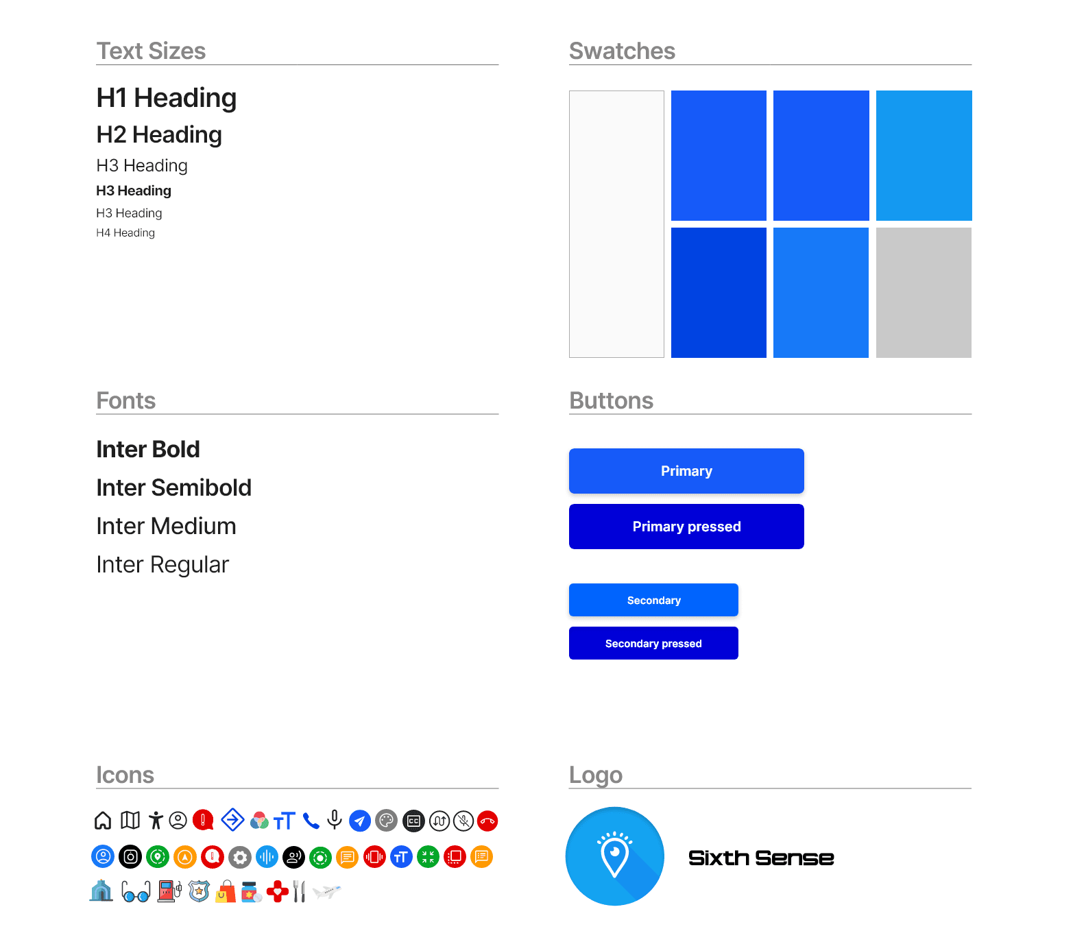
Design System
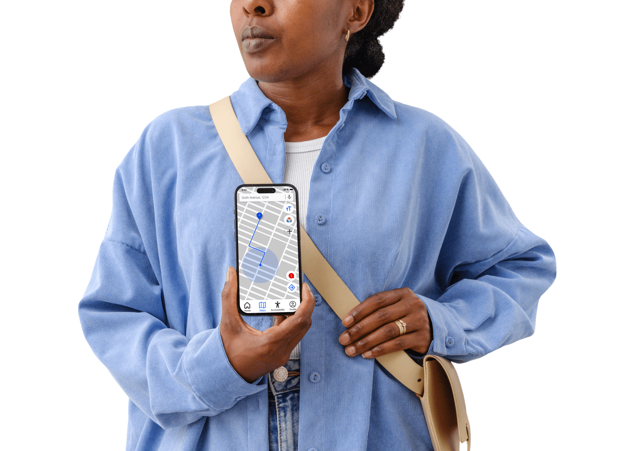
The visual design prioritised clarity, calmness, and trust:
Blue as the primary colour for clarity and colour-blind
accessibility
Large, legible typography and clear iconography
Rounded components to create a supportive,
approachable toneMinimal visual noise to reduce cognitive strain
The interface was designed to feel reassuring rather than
technical.
Presenting The
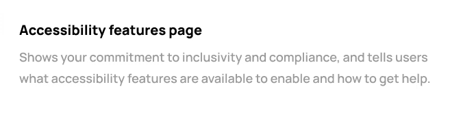
Final Design
The final concept demonstrates how accessibility-first
thinking can reshape a familiar product category.
The design:
Provides reassurance through clear feedback
Reduces reliance on visual navigation
Balances independence with human support
Adapts to users rather than excluding them
While not production-ready, the concept illustrates how
inclusive UX decisions can meaningfully change interaction patterns.
Final Reflections
& Learnings
Behind the design
This project deepened my understanding of inclusive design and the responsibility designers have when creating experiences for users with different abilities. It shifted my focus toward human experience over interface aesthetics.
Key learnings included:
Design beyond WCAG checklists
Accessibility must be embedded from the start
Designing for edge cases often improves usability for everyone
Empathy must be translated into concrete interaction decisions
Future iterations would involve direct collaboration with visually impaired users and accessibility specialists to further validate and refine the experience.
