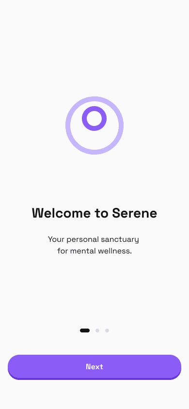
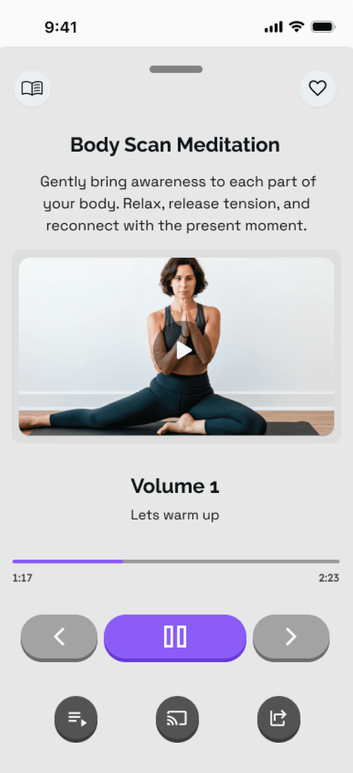
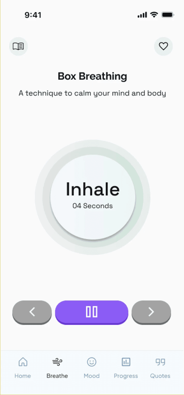
Serene
Side project - a mental wellness app designed for everyday balance and low-effort emotional support.
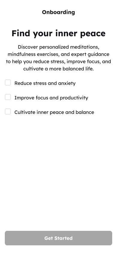
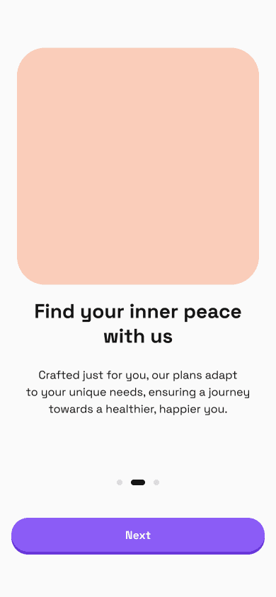
Serene was created to address a common gap in mental wellness apps. While many tools aim to support emotional wellbeing, they often feel clinical, time-consuming, or emotionally demanding - especially for users who are already overwhelmed.
The goal was to design a calm, low-effort experience that supports emotional wellbeing through small, quick interactions integrated into everyday routines.
Problem
Market Problem: The mental wellness market is crowded, yet engagement and retention remain low.
User Problem: Users need tools that, fit into busy schedules, reduce cognitive load, provide emotional safety, and delivers quick, calming wins.
Outcome
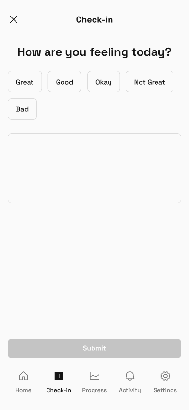
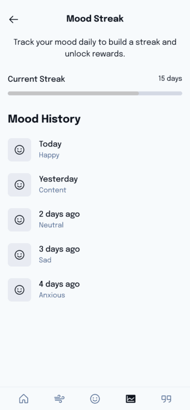
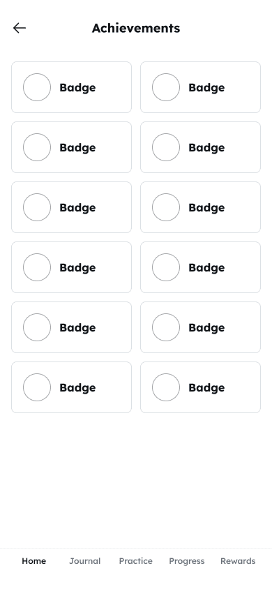
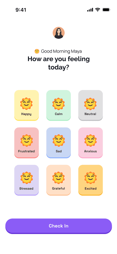
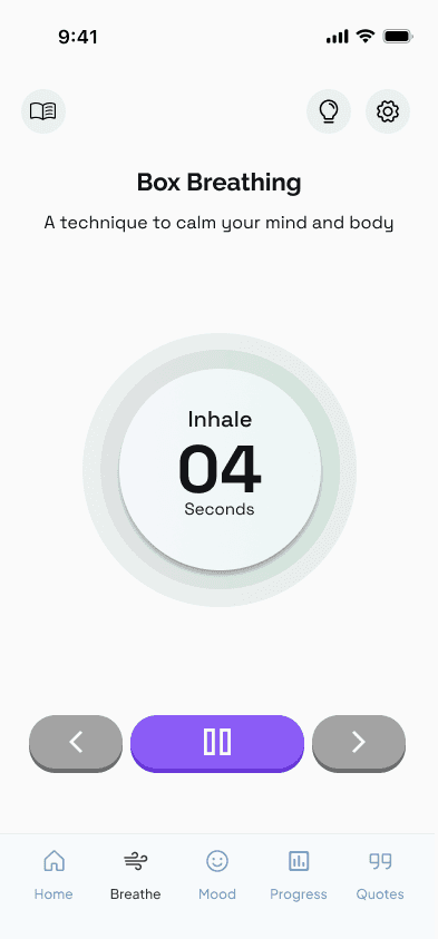
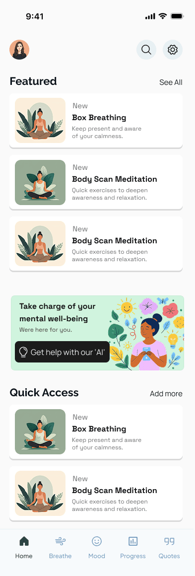
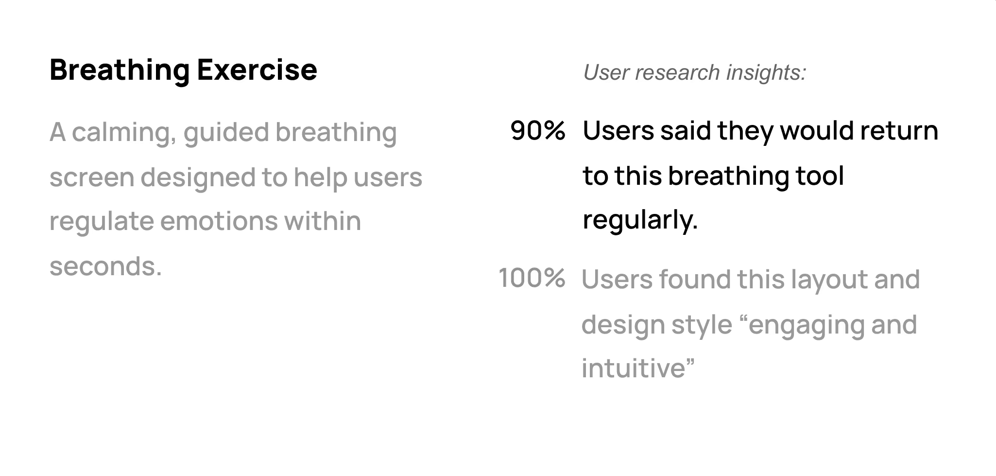
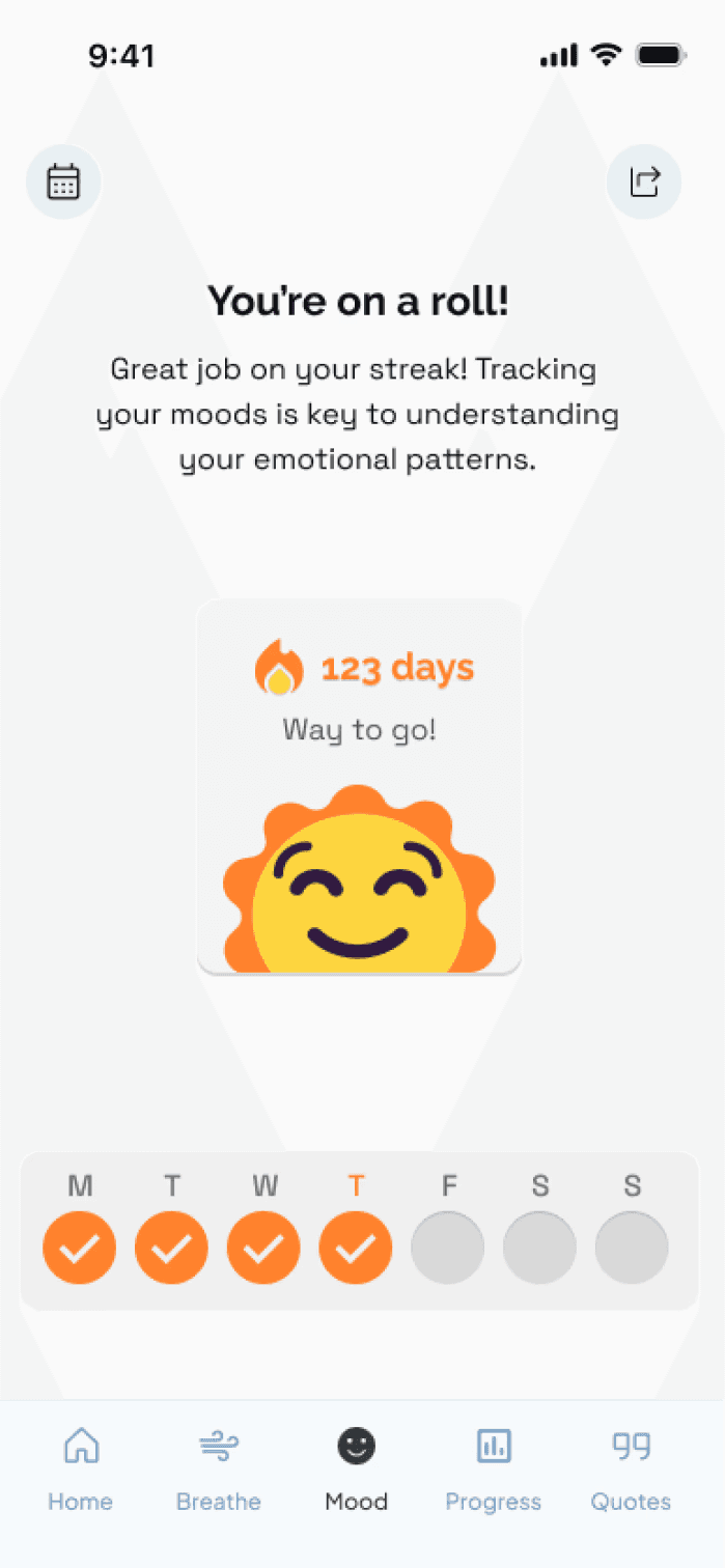
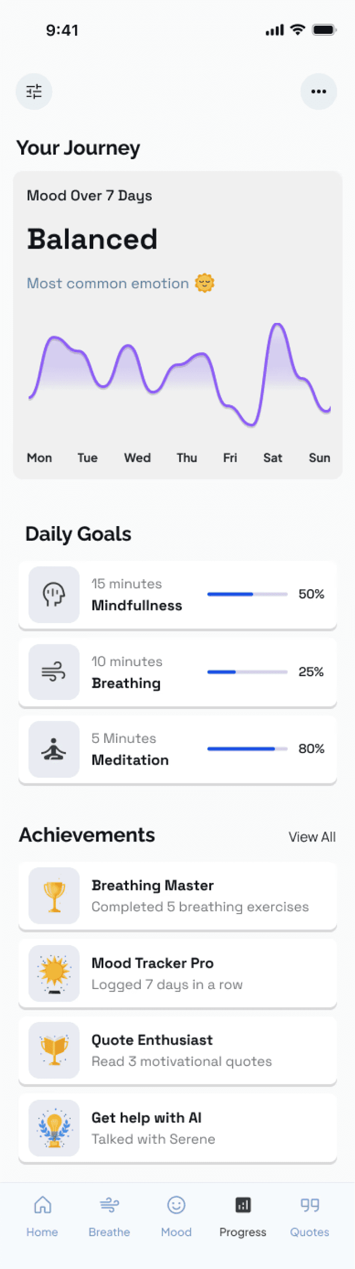
Serene supports mental wellness through quick mood check-ins, 10–30 second micro-practices, and personalized calming exercises.
The goal: build healthier habits without overwhelming users.
Role
UX/UI designer (end-to-end)
Timeline
6 weeks
Tools
Figma, Stitch, Whimsical
Research, Concept,
Designs, User Testing
& prototype in 6 weeks
I led the full end-to-end process - from early discovery to final prototype - integrating psychology, accessibility, and gamification to design an app that feels calm, credible, and motivating... and here's how I approached it!
Part 1 - Discovery & Understanding
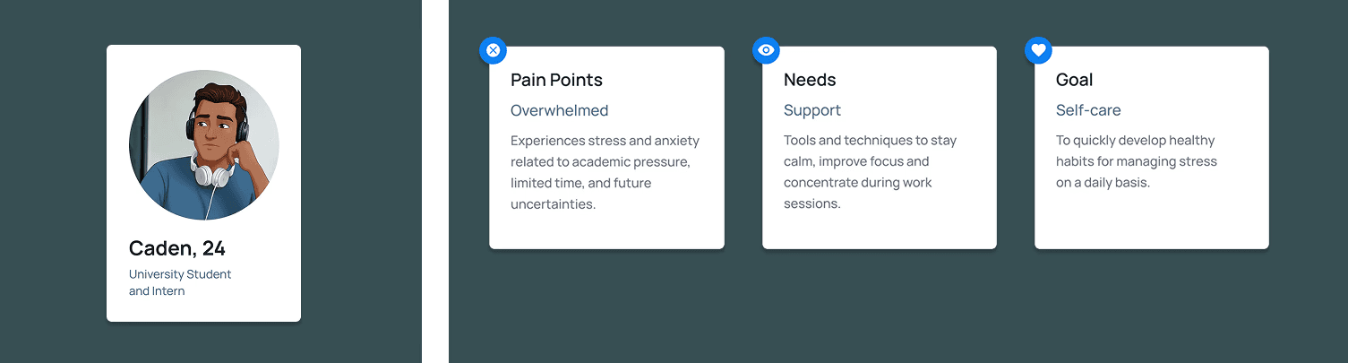
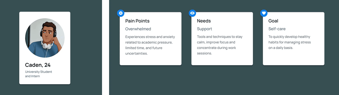
I explored the emotional challenges people face when trying to manage their wellbeing. Through interviews, surveys, and competitor analysis, I defined the core problem, identified key behaviours, and created the primary persona and scenarios that shaped the direction of the product.
Part 2 - Design
Using those insights, I developed the information architecture, mapped key flows, and created wireframes centred on empathy, psychology, accessibility, and gentle motivation. From there, I designed high-fidelity screens with a warm, calming visual language that made the experience feel simple and emotionally supportive.
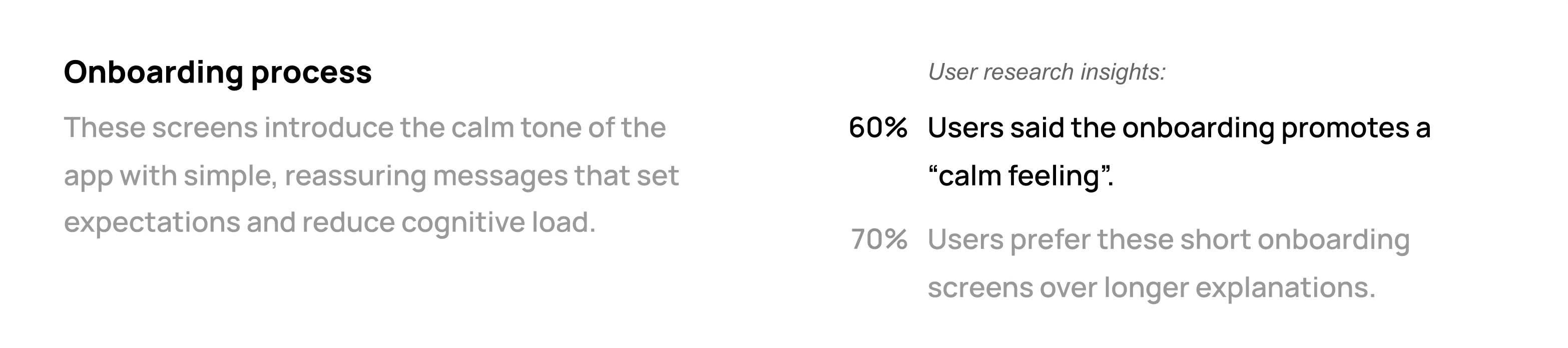
Part 3 - Usability testing & Refinement
I validated the product through usability testing. Feedback helped refine the tone, visuals, and interactions — strengthening clarity, reducing friction, and confirming emotional resonance. These improvements increased confidence in the product’s impact and ease of use.
This approach ensured the product felt calm, emotionally safe, and easy to engage with - even during stressful moments.
Research
Results & Findings
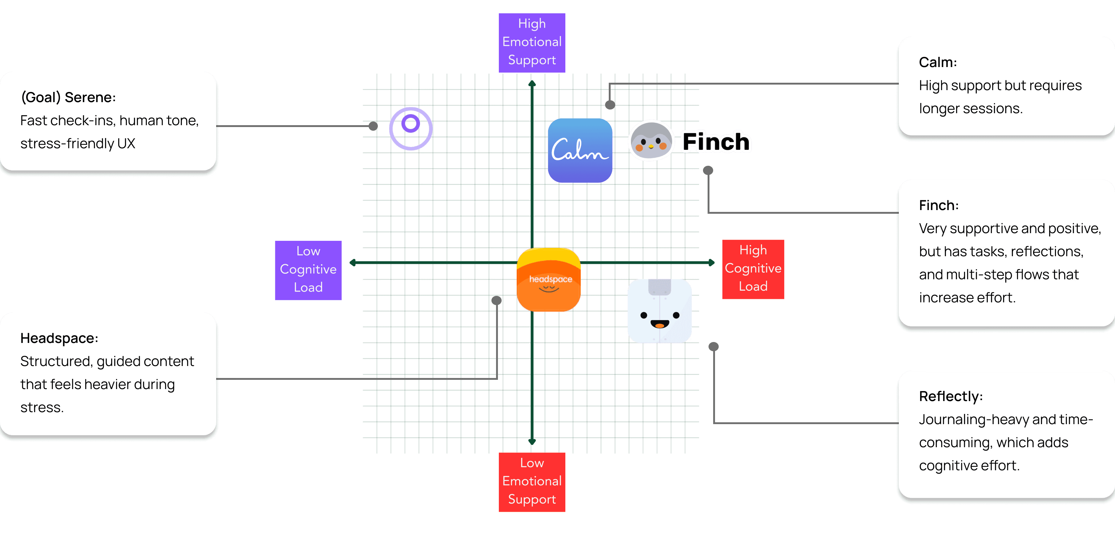
I conducted 6 interviews and a 10 response survey, with most users being young adults. Followed by a competitor analysis of Calm, Headspace, Finch, and Reflectly.
I learned:
• How users currently manage their mental well-being.
• What causes them to stop using mental health apps.
• What features support long-term engagement
• and
How I can build trust quickly.
6/6
Interviewees wanted quick wins (10-60 seconds) between tasks
-
Many apps lack personalized, adaptive guidance (e.g. content that adjusts to mood).
-
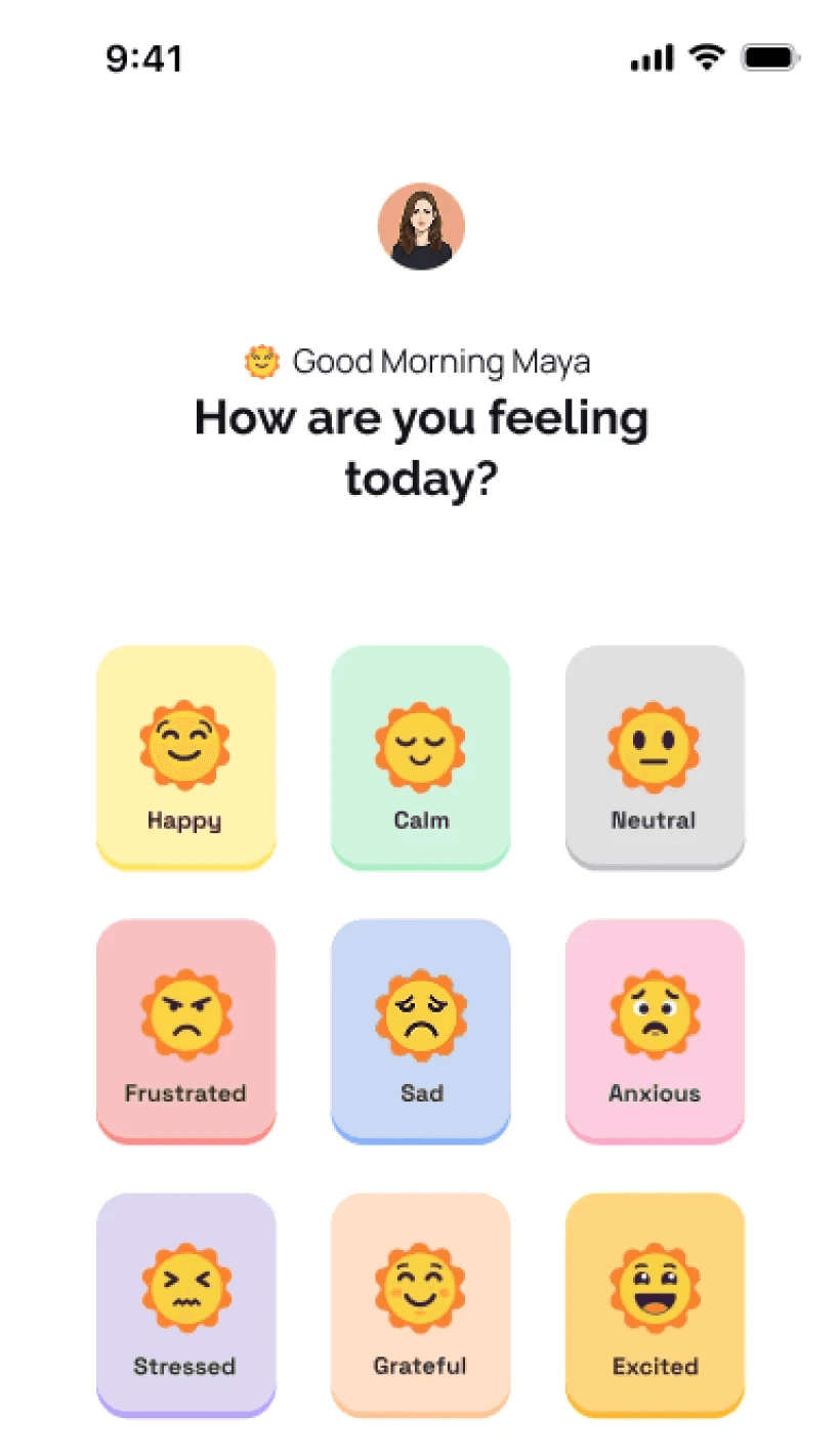
Daily emotional check-ins must be quick. If it takes more than 10-15 seconds, they wont do it consistently.
8/10
Survey respondents felt overwhelmed by complex mental health apps.
-
Trust is built through calm visual design, clear privacy cues, and non-judgmental language.
-
They want coping tools on demand.
9/10
Survey respondents preferred warm, relatable language -not clinical wording.
Competitor Analysis
Identifying
Key objectives
These objectives ensured that the process remained visible, well-defined, and aligned with the overall business goals and models.
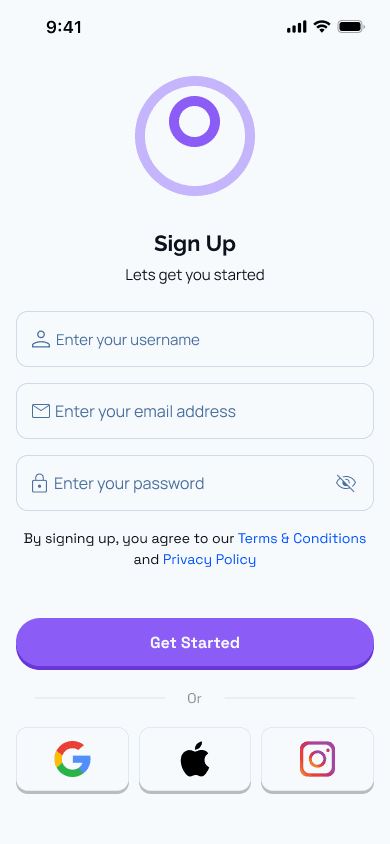
Make mental wellness feel simple and emotionally safe:
Reduce overwhelm and create a calming experience with clear UI, gentle interactions, and supportive microcopy.
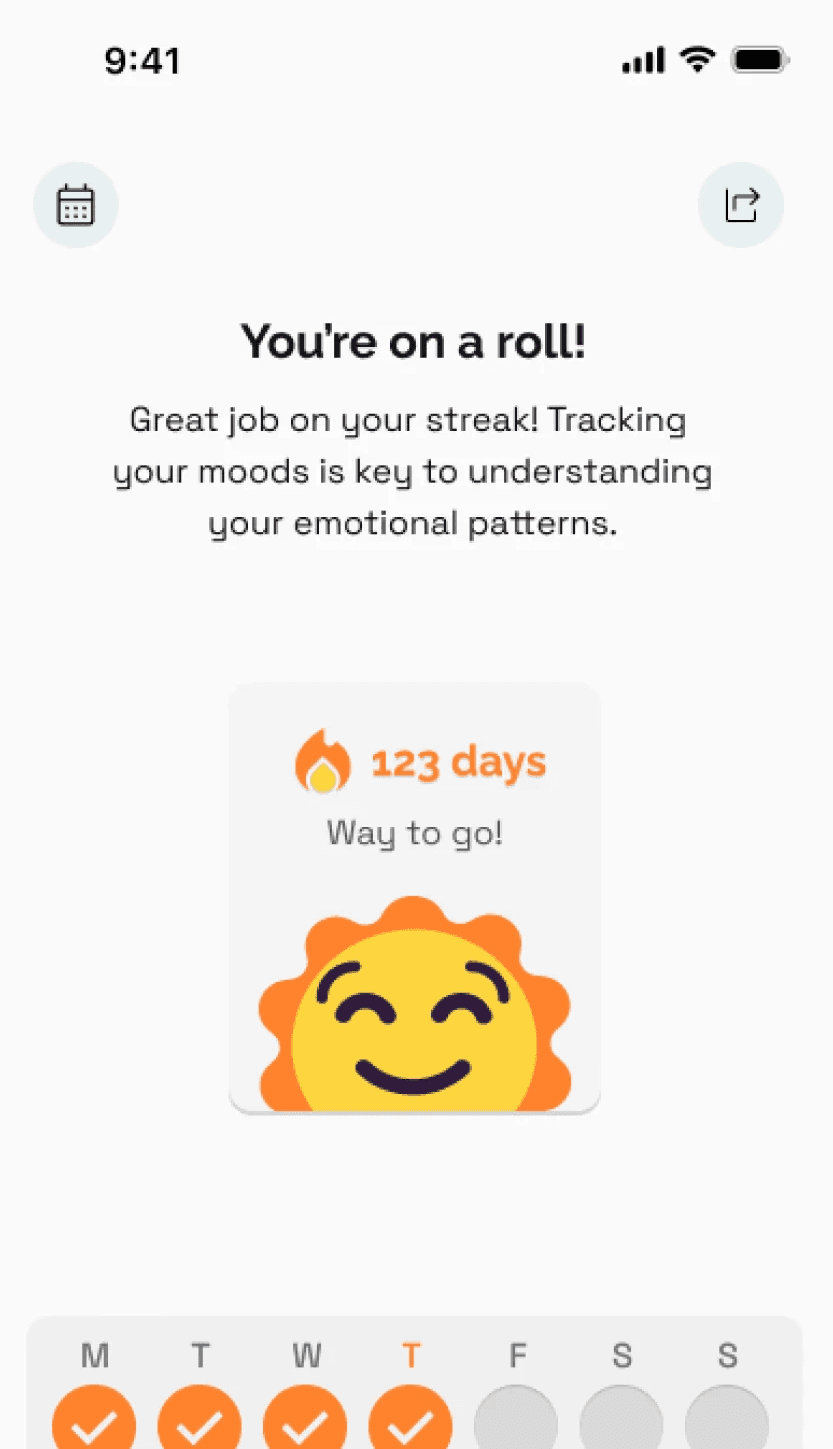
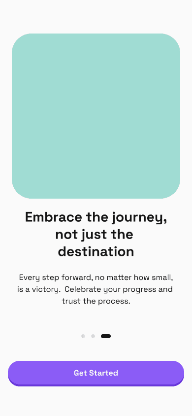
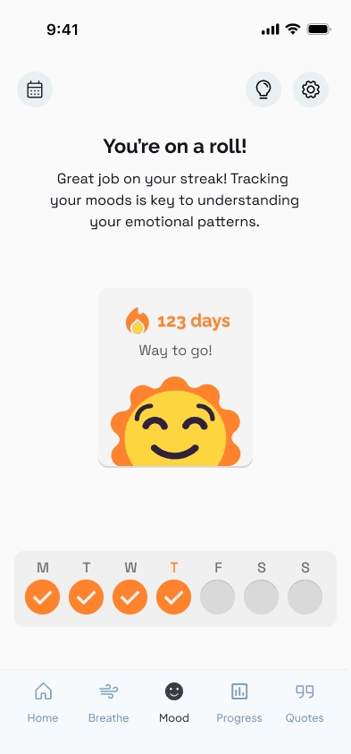
Encourage consistency through positive motivation:
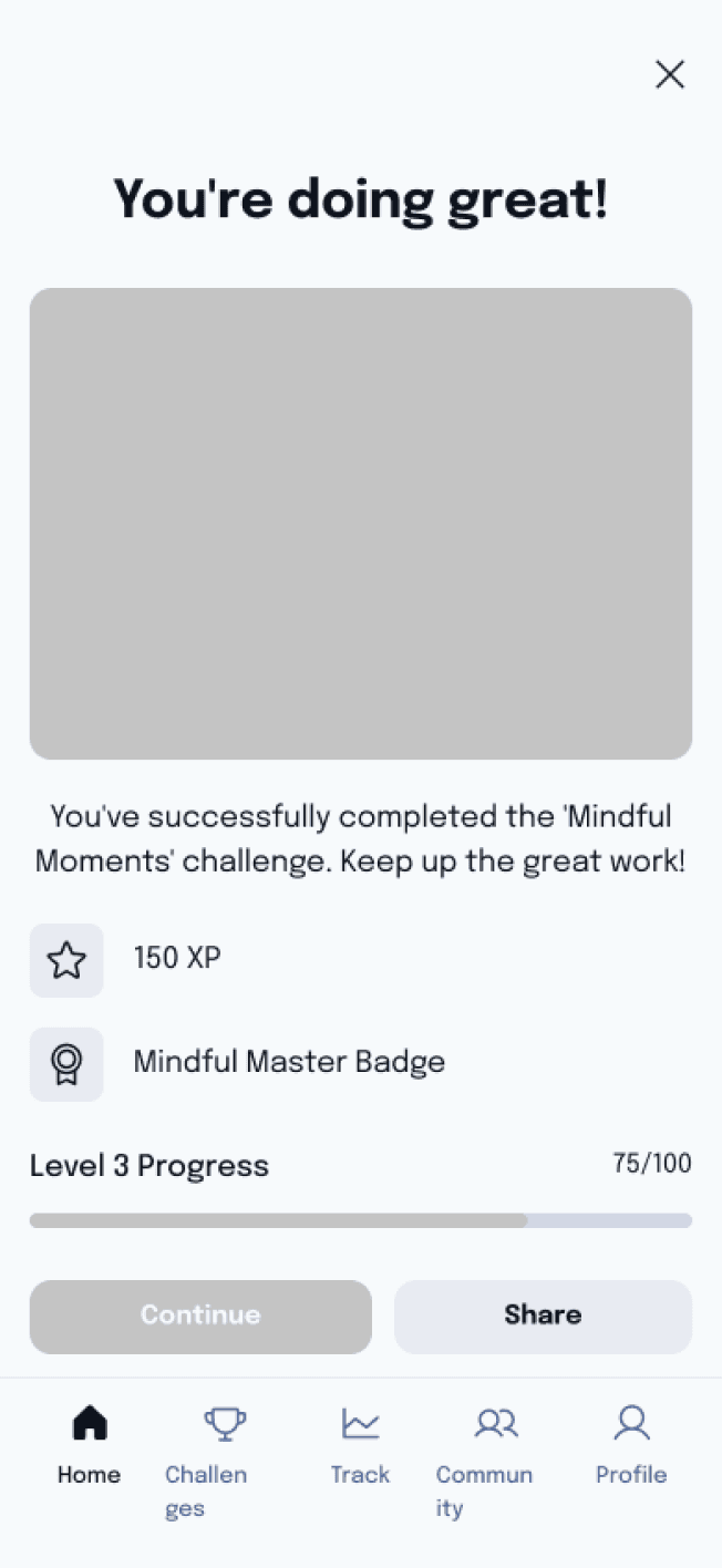
Use small wins, streaks, and meaningful progress indicators to keep users engaged without pressure.
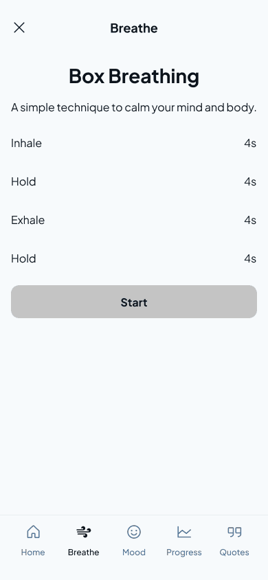
Provide practical, psychology-backed daily guidance:
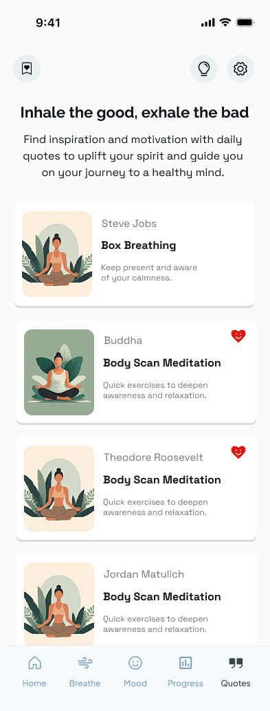
Offer quick check-ins, reflective prompts, and mood-based suggestions rooted in CBT and emotional awareness.
Build a long-term, supportive relationship with users:
Give personalized insights, mood trends, and emotional growth summaries that foster trust and long-term engagement.
Ideation & Structure
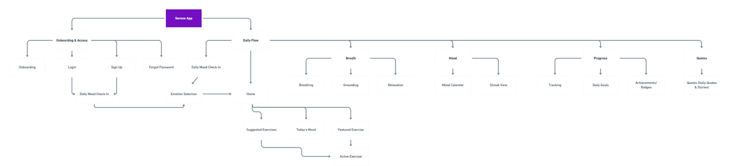
Information Architecture
Creating a clear information architecture helped structure the
product around quick, low-effort interactions, ensuring the app remained easy to understand and navigate during moments of stress.
Wireframes &
Content Exploration
Low-fidelity wireframes were used to explore content structure, task flows, and interaction patterns. This allowed for early usability validation and rapid iteration before moving into high-fidelity design.
Visual Direction &
Design System
A lightweight design system was created to reinforce calmness, clarity, and emotional safety across the interface.
Colour
Lavender Indigo
Primary
Bright Sun
Secondary
Vista White
Background
Typography
Heading Bold
22px / Bold
Subheading
16px / Bold
Body Text
16px / Regular
Card Text
12px / Regular
Components
Primary Button
Secondary Button
Card Component
From Wireframes to
High-Fidelity Design
Wireframes were translated into high-fidelity designs with a
strong focus on emotional tone, clarity, and ease of use. Visual decisions prioritised calm colour usage, clear hierarchy, and gentle microcopy to ensure the experience felt supportive rather than clinical.
Iterating Based on
Usability Testing
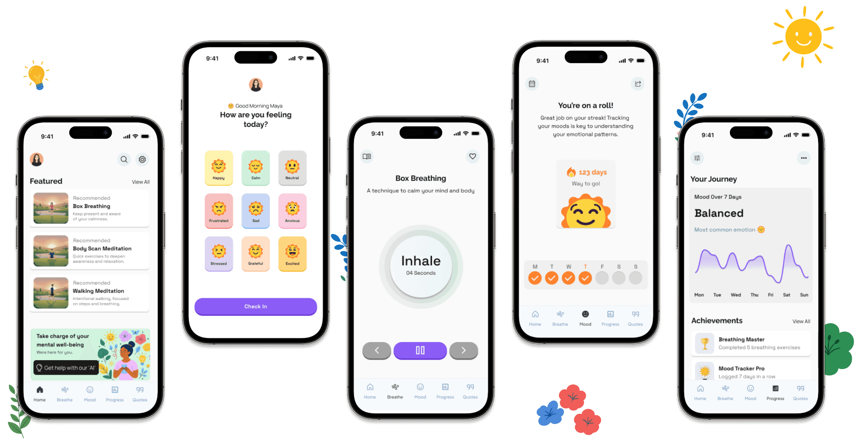
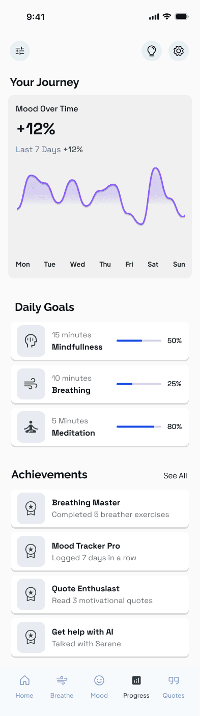
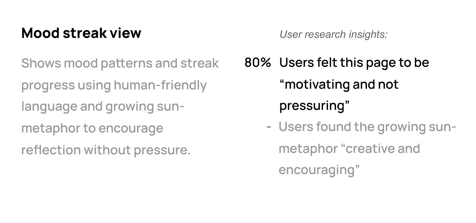
Usability testing revealed that certain visual elements felt too analytical and emotionally distant, which conflicted with the app’s goal of providing calm, supportive check-ins.
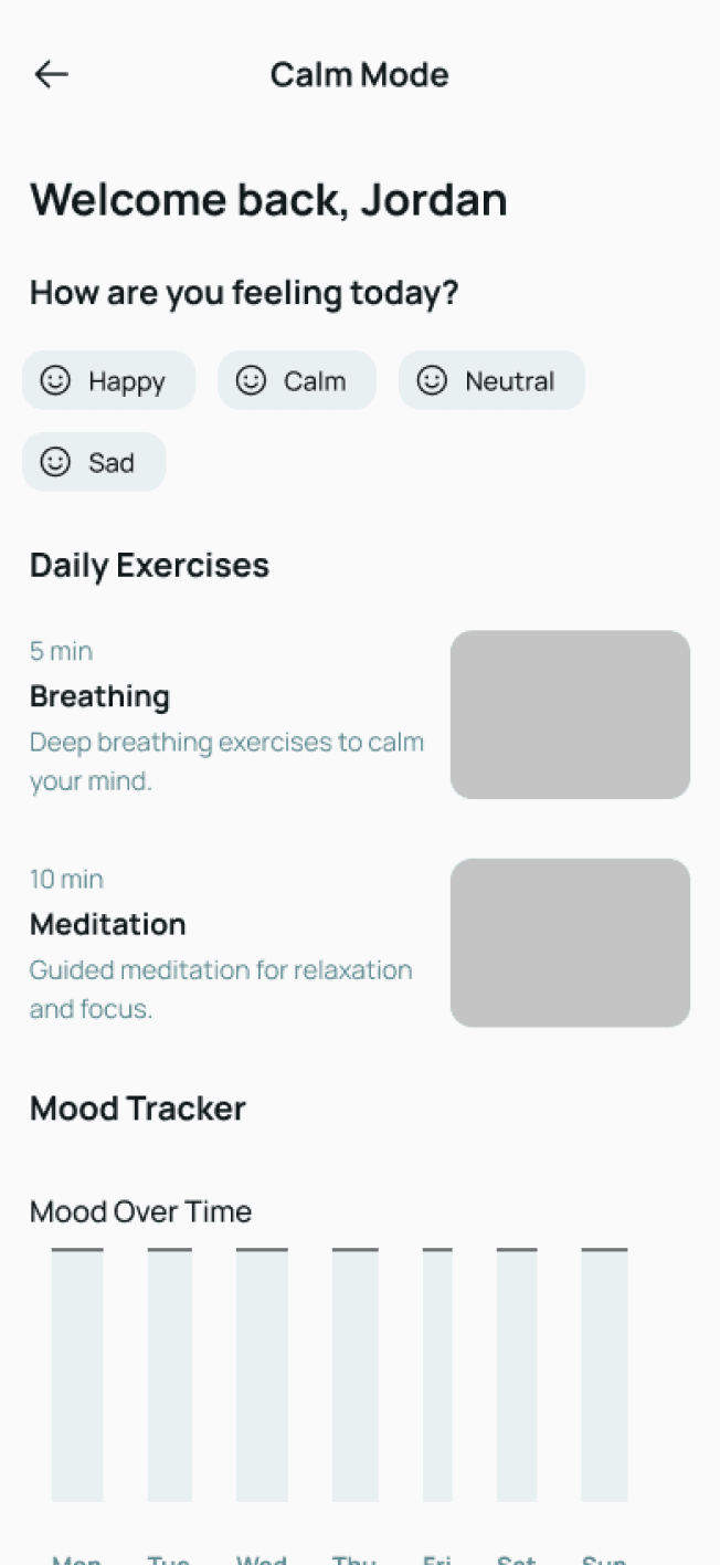
Before usability testing
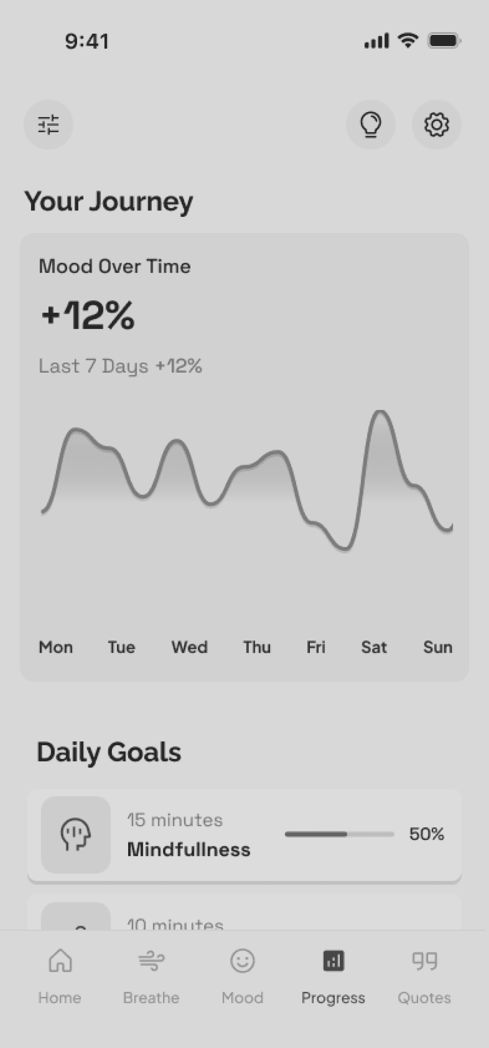
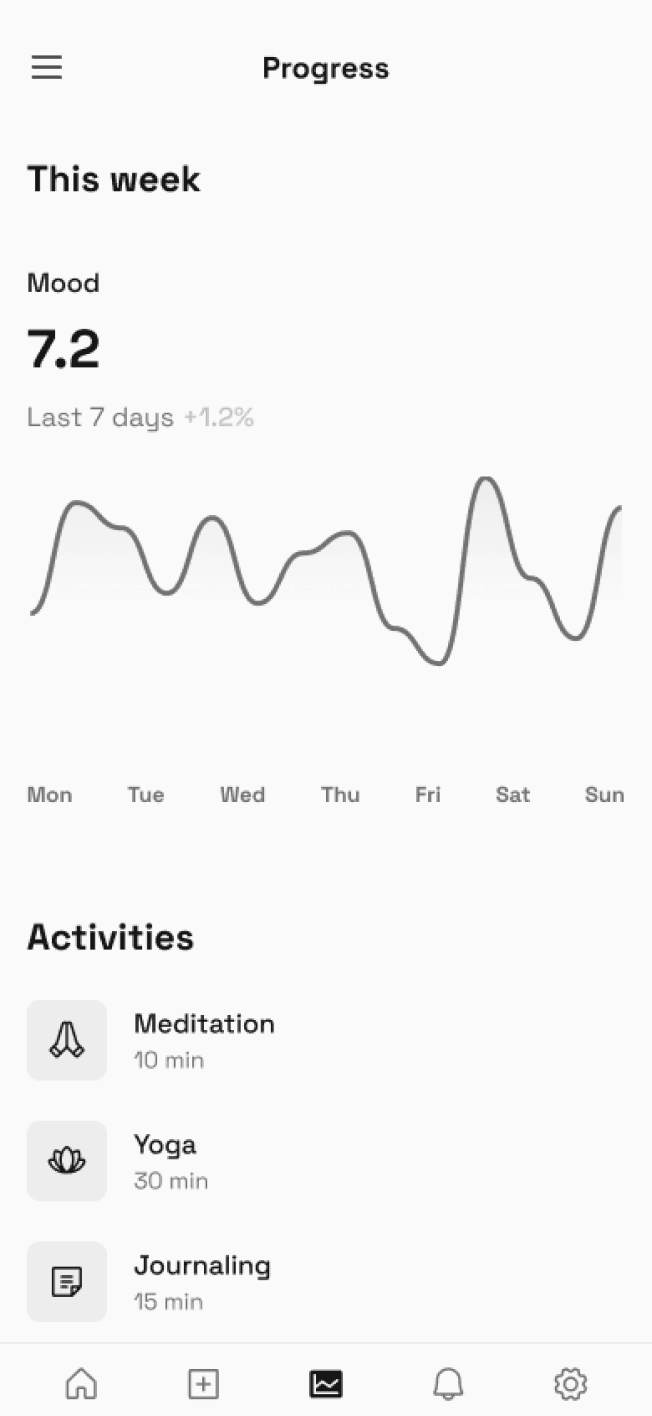
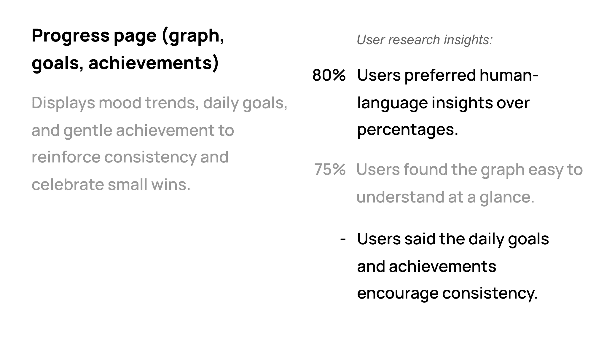
The graph displayed mood trends using percentages and analytical metrics, which felt clinical and overly data-driven for a mental wellbeing context.
After usability testing
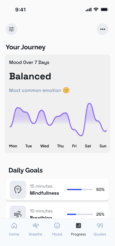
The graph now uses human-friendly language (“Balanced,” “Most common emotion 😊”) instead of percentages, making the experience feel warmer, more relatable, and emotionally supportive.
Presenting
The Final Design
Serene evolved into a calming, credible wellness companion that users trust and return to daily. It blends emotional intelligence, accessibility, and subtle gamification into an experience that feels warm, useful, and sustainable.
Final Reflections
& Learnings
Behind the design
This project reinforced the importance of designing for emotional context, not just functionality. Small details - such as language, visual tone, and interaction length - had a significant impact on how supported users felt.
If taken further, I would focus on deeper personalisation, accessibility testing, and long-term engagement metrics to validate the product’s effectiveness over time.
Serene strengthened my approach to designing calm, human-centred experiences that respect users’ emotional states and cognitive load.
